Tales of Castro Woe
Castro, the podcast player app, is the third-party iPhone app I use the most. Podcasts are a major part of my life, and Castro presents them in a way I find most pleasant. I’ve played around with the others,1 but this one has stuck the longest.
Unfortunately, over the last year, Castro has become one of the buggiest apps on my phone.
The quality of the app, its relentless pace of innovation and keeping up with modern iOS technology, and the communication from the development team have become lackluster. I was disappointed to find myself casually looking for replacement apps and just as disappointed to discover that none of them manage podcasts in quite the same way.
I have a few glaring issues with the app. I’m sure I’m not the only one with issues, so this list isn’t exhaustive and may not be typical.
Lack of developer communication
On the company’s Twitter page, which had long been a reliable source of information, you’ll find that their last communication was on March 29. Well over a month ago, as of this writing. Their support account is similar.
Their last app update was released four months ago, according to the version history of their App Store page. It was a small bug fix update (which is, of course, always welcome).
I understand that app development is inherently complex, time-consuming, and challenging. Their lack of communication is surely attributable to the upcoming iPad app and sync service. I imagine (and hope) that they’re hunkered down and making it happen.
However, to allow the currently released app to quietly degrade and not manage the growing number of issues is disheartening. To stop communicating with their users borders on unacceptable. It makes me feel like I’m paying a subscription for an app that’s been abandoned.
This is an unfortunate turn and makes talking with them feel like shouting into a void.
Missing podcast artwork bug
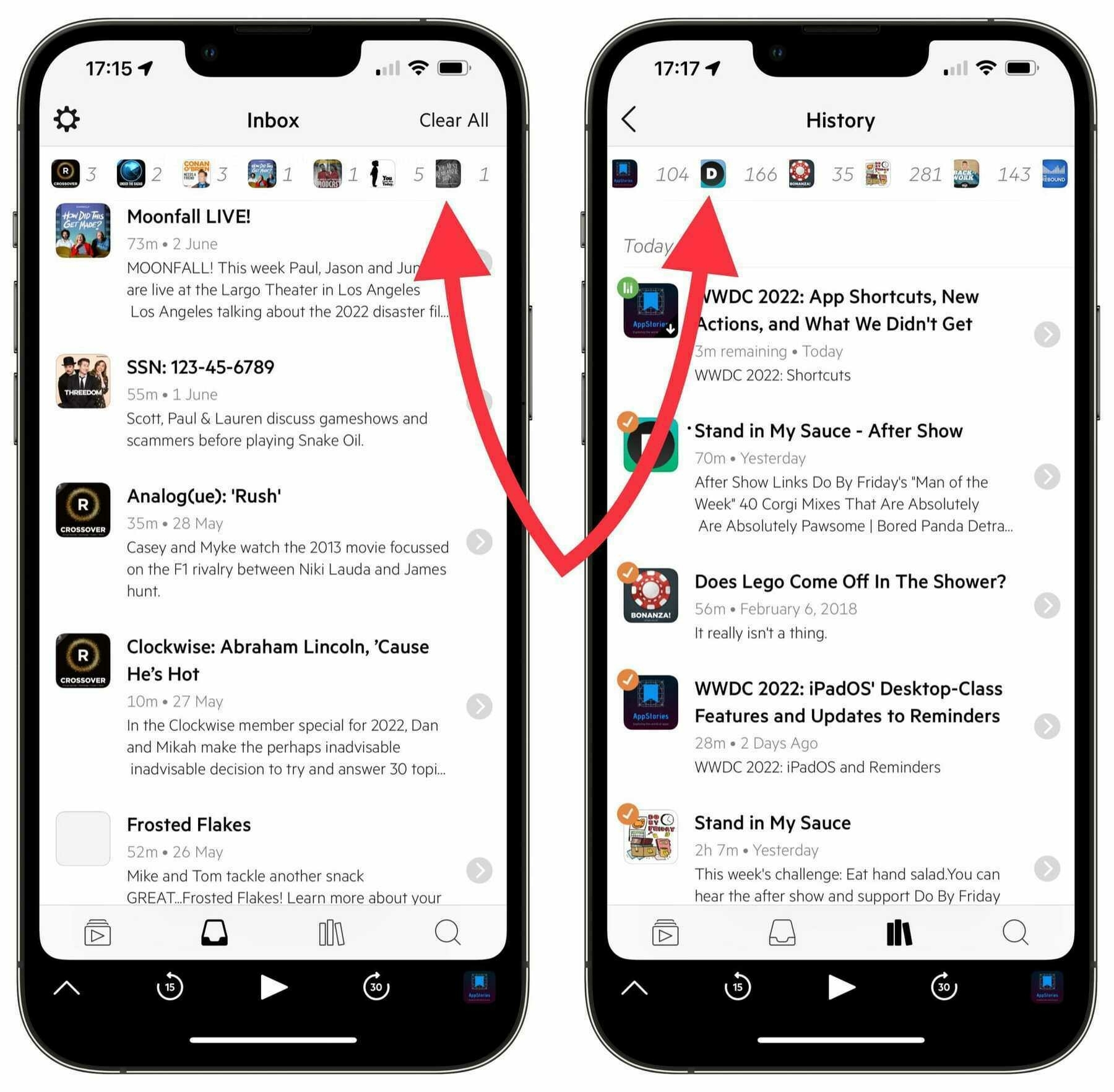
Over the last several months, the main artwork for a growing handful of the podcasts I subscribe to has disappeared. What started with a single show has now infected three. I counted seventeen podcasts with missing artwork while browsing through my History page in the app.
It doesn’t matter if it’s a free show or if I’m paying for it. There was no warning, and there appears to be no way to fix it. I’ve tried power cycling my phone. I’ve tried unsubscribing and re-subscribing to the shows. I’ve tried deleting the app and downloading it again. All that greets me from some shows is missing artwork.
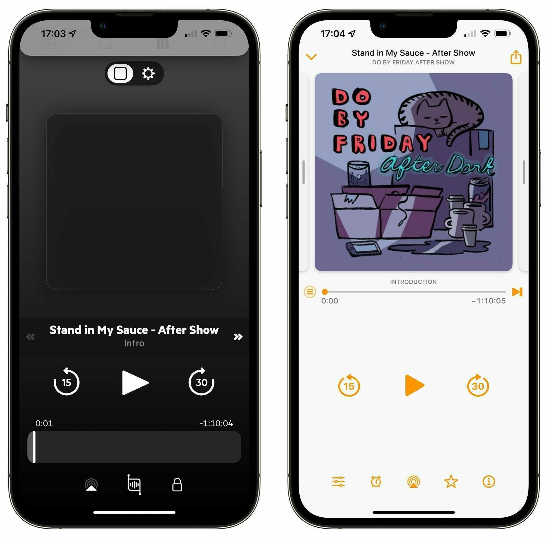
Other podcast players don’t have this issue. Overcast, for instance, shows the artwork in all its glory; Castro only shows a dark square.
Disappearing episode/settings toggle bug
At the top of the playing screen, there’s a toggle to switch between the playback controls and playback settings for the current episode. It’s an easy way to travel between those two screens.
While a podcast is playing, slowly pulling down the shade to show the Queue/Inbox/Library/Discover pages will cause that toggle to shift itself upwards, hiding and making it difficult to interact with.
Pulling the shade all the way down and then moving it back up to show the playing screen again will put the toggle back in its place.
Spacing issue with icons in the top bar of the Inbox screen
At the top of the Inbox screen, there’s a handy row of shows that have episodes awaiting triage. Several of those shows have shifted themselves to the left, obscuring a portion of the small artwork icon. It’s as if the margin between those items isn’t being respected.
This also happens, and more egregiously, in the History screen of the app.
This has been a long-standing issue with the app, or at least my downloads of it, and has followed me over several new devices. I’m beginning to lose hope that it’ll ever be remedied.
Slowing development pace
I mentioned earlier that app development is a complex and time-consuming process. I don’t expect large-scale updates or even small issues to be completed in an unreasonable amount of time.
I want the developers of Castro to live full lives outside of their app work. They shouldn’t be tied to their computers all day, every day.
However, it’s hard to look at an app like Overcast, which received a major redesign a couple of months ago, and not feel a bit envious. While the developer, Marco Arment, has made major improvements and continued fixing bugs, the team behind Castro has done neither and not talked about it.
According to the Credits page in Castro, the development team currently has three people working on the app. I don’t think it’s unreasonable to imagine that three people should be able to accomplish things faster than a single person.
I wouldn’t think of demanding anything from the developers of the apps I use. They’re human beings and deserve time and respect in their work and personal lives. They will never owe me service, coddling, or even a development timeline, even if I am paying for their app.
What I’m ultimately asking for is better communication from the developers of Castro. If it’s slow going with the sync service, fine. Let us know. If the iPad app is proving troublesome, fine. Let us know. If there are bug fixes on the way, fine. Let us know.2 If you’ve got a cool idea for the app or everything is going swimmingly, great! Please tease us with some scant details.
A vaguely passive-aggressive tweet shouldn’t be sufficient. A company that deals with the public shouldn’t be averse to sharing with the public.
I love Castro and I want to continue using it, especially on all of my devices. In the meantime, I feel that many of its users, myself included, would appreciate, at the very least, bug fixes and some sort of indication that it’s not going to be left to wallow in the Museum of Once-Amazing iPhone Apps.

