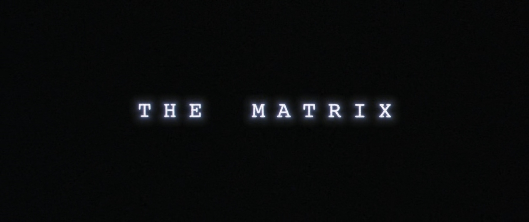
Title Card: The Matrix (1999)
The Matrix was written and directed by Lana Wachowski and Lilly Wachowski. It was released in 1999. The film was produced by Warner Bros., Village Roadshow Pictures, Groucho Film Partnership, and Silver Pictures. The artists for the main titles were Harold De Jesus and Marcel Valcarce.
Thomas Anderson, known by his preferred hacking alias “Neo,” played by Keanu Reeves, lives an unsatisfying life and has always suspected that there’s something wrong with the world he lives in. His suspicions are confirmed when he meets Trinity, played by Carrie-Anne Moss. After an unfortunate run-in with a sentient computer program known as Agent Smith, played by Hugo Weaving, she introduces him to a mysterious man named Morpheus, played by Laurence Fishburne. Morpheus explains to him that the world Neo knows is nothing more than a computer simulation, a construct playing out within the minds of comatose humans as they are used as an energy source by intelligent machines. Initially resistant to this staggering revelation, Neo is soon reborn into the real world, a post-apocalyptic hellscape full of human factories and immense dangers. Morpheus believes Neo to be “the One,” a human who is believed to free humankind. Neo must learn what it means to be alive in the real world, and hopefully, live up to what’s prophesied about him.
The titles demonstrate an unusual juxtaposition in the film. The Matrix, with all of its advanced technology, is personified through ancient computer screens. There’s no color besides green. No icons on the screen. No menu bar to be seen anywhere. The vast complexity of this simulation is shown as raindrops of computer characters. The words “The Matrix” are themselves formed from the physical representation of The Matrix: the sickly green on black glow of old computer screens. This feels like an expert melding of the visuals of the film and the complex ideas that drive its story. From moment one, the film gives us a clue as to what is in store for us.
I recall being held in rapt silence while watching this film in the theater when it came out. You knew you were about to watch something special when those characters started falling from the top of the screen. One of the most thrilling sequences in film history follows this opening title: a squad of police officers and three relentless, terrifying Agents surround the building in which Trinity is holed up. She must fight her way out and into safety, or die trying. To this day, it’s still completely effective. Give that scene a watch again. 🎞
Google, Facebook Pressure Falls Short as Antitrust Measures Advance in House Committee ↗
I’ll readily admit that I don’t know as much about this burgeoning antitrust legislation as I should. However, does this “American Choice and Innovation Online Act” mean that I have the choice to keep any new Apple device I get largely the same as I have them now? Doesn’t seem like it.
I believe that giving the ability of smaller businesses to fairly compete with larger ones is generally good. Lower the cut Apple takes on sales. Make it easier, i.e., not impossible, to go to a company’s website where I can subscribe to their service. Remove the fear that some developers have over dealing with these large companies. However, don’t throw the word “choice” around without understanding and acknowledging that it should cut both ways. I don’t want the overall Apple experience I know and love to be destroyed because, for example, Epic wants its own app store on Apple’s devices.
I’ll also readily admit that I may be singing a different tune if I were a software developer working with Apple’s platforms. As a consumer, though, I’ve had no problem with my past Apple experiences and would like the ability to keep that going for myself. That’s my choice.
I wish there was a version of YouTube Premium that only disabled the incessant, terrible ads that play during videos. I don’t care about any of the other features. At the moment, twelve dollars a month is too much for just ad removal.
For the second time in as many weeks, the power has gone off at home. Thankfully, it’s only been happening super early in the morning.
Still, it feels like a dreadful omen for how the rest of the summer is going to be.
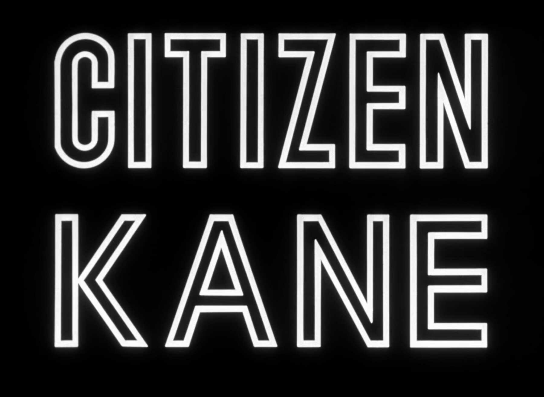
Title Card: Citizen Kane (1941)
Citizen Kane was written by Herman Mankiewicz and Orson Welles and was directed by Orson Welles. It was released in 1941. The film was produced by RKO Radio Pictures and Mercury Productions.
On his deathbed, the elderly Charles Foster Kane, played by Orson Welles, utters one final word before passing: “Rosebud.” Kane, a wealthy newspaper publisher and industrial magnate, has always garnered much attention, so his death is big news. His last word presents a mystery that newsreel producer Jerry Thompson, played by William Alland, is tasked with uncovering. Through interviews with Kane’s friends and associates, more is learned about the history of this prolific and imposing man. His newspaper business, his failed romantic relationships, and the great highs and lows of his life are described by those who knew him. By the end of this tale, there is a greater understanding of the man, but will anyone ever discover the true meaning of the word “Rosebud”?
At this point, there’s probably little to be gained from me waxing on about the importance of this monumental film. The subject matter has been talked to death. The character of Charles Foster Kane, and his clear inspiration in William Randolph Hearst, have been dissected enough. Heck, most everyone probably knows what the heck “Rosebud” is by now.
Instead, what strikes me most about this title card is not the film that follows, but instead the imposing nature of the letters. The words “CITIZEN KANE” take up the entire screen. They’re as large as the film itself, which is to say, larger than life. They tower over the audience in a pompous, arrogant, and self-important manner, as if to reflect the personality that’s central to the film. However, behind that grand façade lies an insecure man who longs for the comforts of his childhood. The letters of the title card might be seen as something of a put-on. A shield that Kane can use to hide behind, all the while wishing that he could recapture his youthful happiness while hiding away from the dread that comes with facing the world he built for himself. The title card personifies a man who is theatrical and legendary for the world, yet diminutive in private.
Also, I’ve really been captured by the first trailer for the film. It’s still unlike anything you’ll ever see. For a film that was released in 1941, it feels far ahead of its time. Considering how unusual the trailer is, it’s probably far ahead of any time. Instead of a tapestry of shots from the film that describe the general plot, we’re treated to a voice-over from Welles himself, narrating aspects of the production and introducing many of its main players. Give this fascinating thing a watch. 🎞
I’m finding myself less interested in absorbing any sort of news and more interested in just watching a lot of ‘90s WB cartoon shows.
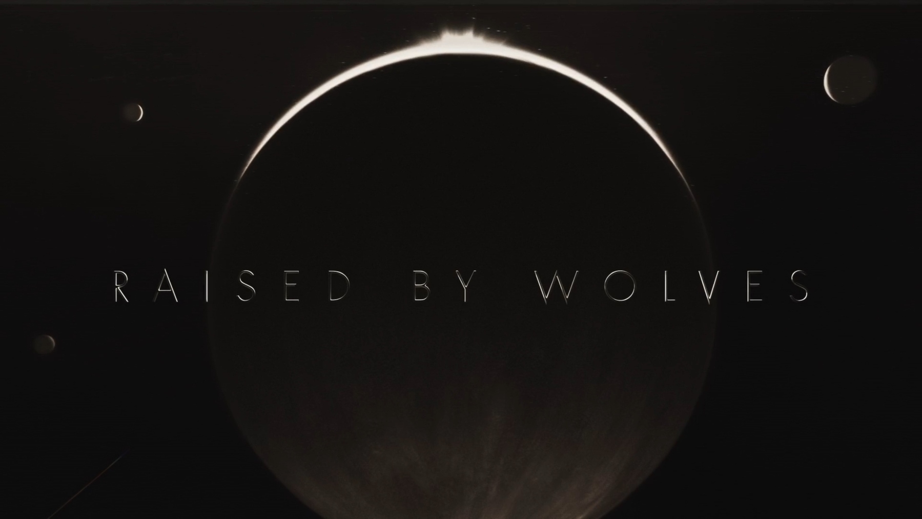
Title Card: Raised by Wolves (2020)
Raised by Wolves was created by Aaron Guzikowski. It premiered on HBO Max on September 3, 2020. The show was produced by Film Afrika Worldwide, Lit Entertainment Group, Scott Free Productions, and Studio T. The titles were directed by Steven Small and created at Studio AKA.
In the future, there is a war between the devout Mithraic believers and the atheists. Following the destruction of Earth, two androids are tasked with traveling to Kepler 22-b and raising children on this new planet. Mother, played by Amanda Collin, and Father, played by Abubakar Salim, develop a small community with their children. All is as well as this new life can be, until a straggling colony of Mithraic humans crash lands on the planet after Mother destroys their ship. The remaining humans manage strife within their ranks while trying to save their children that have been taken by the androids. Within this colony are two atheists who are hiding their true identities: Marcus (once known as Caleb), played by Travis Fimmel, and Sue (once Mary), played by Niamh Algar. Marcus’s devout atheism (and Sue’s trust in him) is tested when he begins to believe that he has a divine presence living inside him.
I love a good Ridley Scott production and this one has it all: androids, mysterious planets, human drama (even amongst the non-humans). While the famed director may not have been the leading creative force behind the show, his name is still powerful enough to make this show required viewing. Now that I’ve finished the first season, I’m left with a thousand more questions than when I started watching it. What secrets does Kepler 22-b really hold? Why does Marcus believe he’s basically the second coming of this Mithraic god, and is it actually one of the androids’ children? What in the absolute hell was that flying snake monster that Mother birthed? I’m really looking forward to the second season where I hope many of those questions will be answered. I’m especially hoping that this show won’t be axed because it’s too expensive for the viewership it might be receiving.
This show is a great example of how to tell a story without bludgeoning an audience over the head with a mountain of exposition in the first episode. By the end of the first episode, you are not going to know what brought the androids to Kepler 22-b, you won’t know the full extent of the war that’s happened on Earth, and you sure as heck won’t know the full capabilities of all characters involved. There’s nothing but hidden layers here. I like a show that invites its viewers to unravel its mystery slowly. It requires a lot, but it gives a lot in return.
The full opening titles for this show are transformative to behold. I’ve never seen anything quite like it. The dark, painterly quality of them makes for a melancholic and tense mood. Accompanied by the ethereal voice of Mariam Wallentin and the composition by Ben Frost, the titles are transformed nearly into a contradiction. Some may find only gloom in them and I wouldn’t disagree with that assessment. However, I think there’s also great beauty in the pairing of these images and the music. Even if you don’t want to watch the show, I think the titles are worth your time.1
-
Now if we could just get the theme song onto the various streaming platforms! I would love to listen to this song without the aid of HBO Max or YouTube. ↩︎
I enjoyed Apple’s opening keynote presentation for this year’s WWDC. It wasn’t a particularly flashy event—this far into the COVID pandemic, they’ve toned down their “look at me” camera work and are mostly focusing on delivering information,1 of which there was a lot.
However, what I did find frustrating, as someone who enjoys using their expansive iPad Pro for both play and work, is the continued lack of extended display support for this device.2 It’s an unpleasant situation that persists, year after year. There was a lot of speculation that 2021 would be the year that iPad fans would be gifted with the ability to completely fill our widescreen displays, run different apps on different screens, and move content between our devices and the monitors to which they can be connected. Alas, that did not happen. We’re stuck with the inferior mirroring support we’ve always had.
The puzzling part of all this is the new iPad Pros have the same M1 chip that can be found inside Apple’s far more display-capable Mac computers. There should be nothing preventing the M1 iPad Pros from enjoying the same external display abilities that are given to all of the Macs. And yet, here we are again. I can think of two reasons why this might be the case:
- There’s a new, hopefully cheaper, Apple-branded monitor on the way and they’re waiting for its release to unveil awesome new iPad features.
- This continues to be an artificial limitation set by the perpetually lagging iPadOS software.
There’s no evidence to back up the first possibility. Heck, they just spent a large portion of their April 2021 event talking up the truly amazing mini-LED display in the new 12.9” iPad Pro. It may undercut the unique advantage it has if they were to release a product that removes that advantage so soon after its respective event.3 Why buy the 12.9” iPad and that hypothetical monitor when I can just get the monitor for the iPad I already have?
Indeed, there’s no definite indication from the people that matter, i.e., Apple, that there’s any sort of forthcoming monitor. Their current stance boils down to “if you want an Apple monitor, then you can feel free to spend at least $5,000 on our glorious Pro Display XDR.” At the moment, any possible Apple alternative to that display lives only in our collective dreams.
The far more likely possibility is that iPadOS 15 continues the long tradition of the iPad’s software falling far short of its amazing, powerful hardware. This is also the sadder possibility. While we were gifted with a preview of some truly excellent upcoming features during this year’s presentation, to omit the sort of external monitor support that they grant their other computers sends the message that Apple still doesn’t fully believe their own iPad messaging. An iPad can be so much more than “just a computer,” but despite what they think, it’s still a computer. Either all that or they’re continuing to ignore the clear fact that many people do real work on their iPads. Both are likely. I don’t know which is worse.
What would make the iPad “more than a computer” isn’t just the Apple Pencil, touching the screen, or ARKit. It would be the ability to do all that a computer can currently do and then more.
But hey, maybe it’ll happen in iPadOS 16… 🍎
-
Nor is it ever Apple’s obligation to provide a Hollywood caliber event with pyrotechnics, extreme visual effects, and a live band. We could have just had Craig Federighi sitting on a stool and reading off a teleprompter, a perfectly acceptable alternative. They’re not required to present entertainment, no matter what the internet thinks. We’re all lucky that Apple chooses to do more than that to varying degrees. ↩︎
-
I’m confident in saying that @pimoore has got my back on this one. ↩︎
-
Ah ha, there’s a third reason! ↩︎
I think my favorite part of WWDC is making the determined choice to stay off of places like Twitter while the presentation is happening. I sure as heck don’t need that much cynical snark in my life. 🍎
There’s been increased talk online about UFOs lately. After spending the morning with a stupidly, insanely rich couple, I can safely say that the people who are really not of this world are the ridiculously wealthy.
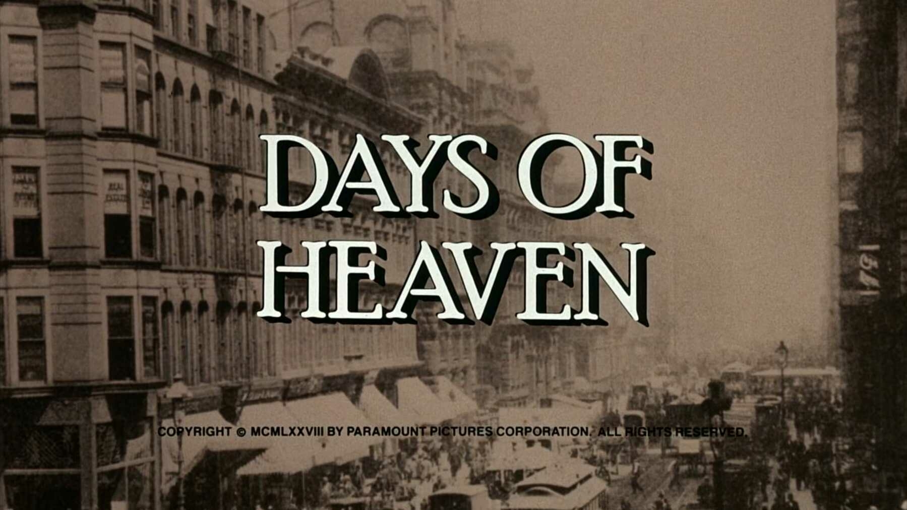
Title Card: Days of Heaven (1978)
Days of Heaven was written and directed by Terrence Malick. It was released in 1978. The film was produced by Paramount Pictures. The main titles were designed by Dan Perri.
After accidentally killing his supervisor, Bill, played by Richard Gere, flees to Texas with his girlfriend, Abby, played by Brooke Adams, and his younger sister, Linda, played by Linda Manz. The trio become employed as wheat harvesters on a farm owned by a character played by Sam Shepard. Realizing that the farmer’s failing health presents a cruel financial opportunity, Bill and Abby scheme to take his fortune by having her marry the farmer. As they often do, their best-laid plans fall apart when the farmer learns of Bill and Abby’s true relationship.
This film was famed for its beautiful cinematography and that still holds true today. There is some impressive filmmaking happening every year, and yet, Days of Heaven is still a towering presence. The unusual circumstances surrounding its cinematography are equally notable—Néstor Almendros, the film’s cinematographer, was beginning to lose his sight during the production. He had assistants take photographs of scenes and would then examine them with strong lenses. The troubled production ran so over schedule that Almendros had to leave to attend to a prior filmmaking commitment. He tasked Haskell Wexler, a legend in his own right, to finish the film in his stead. What resulted was a moving film that has stuck in my head ever since I first saw it. It’s elegant in the finest sense of the word.
The improvisational filmmaking style that Malick and Almendros developed was frustrating to most of the crew. Damn the lighting setups! Forget about intricately blocked scenes! Call sheets? Who needs ‘em?! This was a most unusual production at the time,1 but it laid the groundwork for Malick’s style in later films. It’s remarkable to see how formative this film was for him. With it, he developed a style of serendipity. This is on full display in films like The New World and The Tree of Life where the camera is an invisible participant in the actor’s performances, instead of a central fixture. Days of Heaven is notable in itself, but its legacy also continues to reverberate through Malick’s work.
There’s a moving essay written by The Criterion Collection’s staff writer and social media director, Hillary Weston, about Sam Shepard’s quiet, elegiac performance. For anyone who’s ever been moved by the work of this beautiful writer and actor, it’s a lovely read. 🎞
-
And still is for nearly every film that’s ever been produced. ↩︎
The WarnerMedia-Discovery merger continues to roll along. Say hello to Warner Bros. Discovery!
…
A less creative and exciting name there could not be, but I guess that’s not the point. I can’t wait for the upcoming app which will surely be named: HBO Discovery Max+.
Letterboxd Diaries—May 2021
- Room: I feel like I’m still struggling to absorb everything I saw while watching this marvel of a film. It was powerful, sad, and ultimately, redemptive. I’m absolutely amazed by the performances Brie Larson and Jacob Tremblay gave. They both deserve every accolade they received for this film. It’s going to stick with me for a long time. (★★★★½)
- The Favourite: Leave it to Yorgos Lanthimos to make a period piece as strange and uncomfortable as this one. Leave it to Olivia Colman to absolutely kill it as the petulant and demanding Queen Anne. Absolutely don’t skip over the towering performances given by Rachel Weisz and Emma Stone. This is a peculiar film because it’s full of everything that makes a film great, and yet it’s hard to watch at times. It’s unpleasant, in your face, and will refuse to leave your mind after you finish. It’s unique, and that’s a damn hard thing to find in the movies these days. (★★★★)
- Z for Zachariah: Oddl,y I would have loved to see a much longer version of this film. Show me more of the characters’ daily lives after an apocalyptic event. Give me a slow burn on the increasing tensions between Margot Robbie, Chiwetel Ejiofor, and Chris Pine. What I don’t want is a rushed loved triangle and unexamined hurt feelings. I loved the performances. I just wanted more story. (★★★)
- WeWork: or The Making and Breaking of a $47 Billion Unicorn: I saw this one while recuperating from my second COVID vaccination, and I think that was a mistake. There are few things that are going to make me more sickly and hopeless than watching a smooth-talking cult leader explain in greeeeeeat detail how we’re all WE. We’re all together. We can do great things through the power of thoughts and blah blah blehch. Also, he needs gobs of money to make it happen because that’s just how swindlers do things. I won’t deny that Adam Neumann was a smooth talker, but in the end, he was way too high on his own supply. (★★★)
- The Transporter: Jason Statham kicks people’s faces, sleeps with women, and slathers himself down with oil while half-naked. This all happens to a soundtrack that was probably called “Luc Besson’s Naked Rubbing Time Playlist” and was most assuredly made by Besson himself. (★★½)
- Foreign Correspondent: A pretty decent Hitchcock film is still a damn sight better than a lot of other films. Foreign Correspondent keeps the thrills and duplicity going at a fine pace. As with many of his earlier films, this one is overshadowed by the towering legends of his best work, but that doesn’t make it any less satisfying. You can really feel the director figuring out how to tell grander stories. He’s stretching out his talents. He’s laying the groundwork for what’s to come, and that’s a foundation you can build a damn house on. (★★★½)
- The Verdict: The film that kicked off my newfound appreciation for courtroom dramas. Paul Newman is one of the most captivating performers of his time and here he gives one of his most understated performances of his career. His beleaguered Frank Galvin is an admirable man looking to fight a system that’s intent on crushing him. He dares to fight this film’s version of The Man and it nearly does him in. Sidney Lumet directs a script written by David Mamet. The combination of these three legends is probably all you need to know about this magnificent film. (★★★★½)
- A Few Good Men: A knock-down, exultant film about a team of military lawyers looking to bring justice to a world that often operates outside of the law. Wrongdoings are done in the name of national security and this brave cadre dares to meet the orchestrators of the crime head-on. The ending is bittersweet—justice is found, but at the loss of purpose for a pair of soldiers caught up in one person’s machinations. Nonetheless, the performances are riveting. There’s a clear reason why much of this film is still so present in everyone’s minds. It leaves an indelible mark, and sticks with you. (★★★★)
- Philadelphia: If someone needs any indication that the ‘80s (and early ‘90s) could be an extremely rough and close-minded time, they should look no further than this film. There are some masterful performances here, but none more so than the one that Tom Hanks gives. He truly deserves the Oscar he received for his tragic Andrew Beckett. It’s quite the thing to watch a person deteriorate into nothing as his livelihood and existence is picked apart, ridiculed, and reduced to ignorant assumptions about gay people. This is powerful and important stuff. I’d call it a must-watch for everyone. (★★★★)
- Monsters: For a film with the name it has, there are few monsters seen. I think that’s to its benefit. Much like how you don’t see Jaws until the very end of that film, the fear and power surrounding these alien creatures only grows in strength when you don’t see them. They’re spoken of in news broadcasts and frightened whispers, making them seem more fearsome than they might actually be. Indeed, I wonder if they’re actually the “monsters” that the title refers to, or is it really the human beings that keep trying to destroy them for daring to exist on this planet? Scoot McNairy and Whitney Able give great, improvisational performances. They tie the film together and give it an actual, meaningful story. (★★★★)
- Suspicion: Boy, will this one keep you guessing throughout its entire running time. What’s going on with Cary Grant? Why can’t he keep a job? Is he actually some maniac on an unstoppable murder rampage? It’s a fun film to watch on a lazy weekend afternoon, as I did. Joan Fontaine won an Oscar for her performance in this film, and while I do think she deserves all the awards, her performance in Rebecca was the stronger of the two. Still, it’s nice all around. (★★★½)
- A Goofy Movie: Talk about taking a step back into the ‘90s. This was a nostalgia trip all the way. It came out in 1995, and I’m certain I saw it in the theater. Probably with my dad. That’s a great way to see a film like this. Parents would do well to watch Goofy try his damnedest to bond with his son with their own children. It’s a nice ride and the music was awesome. (★★★)
- Yojimbo: Toshiro Mifune was always one of my most revered actors. He’s quickly becoming my absolute favorite. The first thing I saw him in, as I’m sure is the case for many others, was Seven Samurai. He’s wrestled some control back from his wild Kikuchiyo character and turned himself into a confident, daring ronin named Sanjuro. He’s clearly the star of the film, but the story and the supporting cast (especially Tatsuya Nakadai) round everything out and turn this film into a classic that’s still as thrilling and fun as it must have been when it first premiered. This should be required viewing for any film lover. (★★★★★)
- Another Round: At the end of this film, three alcoholics mourn the death of their alcoholic friend by getting wasted. Absolutely day drunk, as they have throughout the entire film. This is after they risked their jobs, marriages, and lives in the pursuit of a dumbass theory about how you can be your best when you’re always a little drunk. The film spent a good portion of its time showing how alcohol can dismantle a life—a worthy message—and then undercut itself at the very end. Although, I guess that’s part of the point: alcoholism is a pervasive, corrosive disease that’s damn hard to battle. Still, as someone who dealt with an alcoholic for most of their life in a way that was eternally unpleasant, I saw nothing redeeming or enviable about these characters. They’re not worth emulating or looking up to. They were sad, pitiable people who were all too willing to ignore their problems instead of actually working on them. Mads Mikkelsen (and the rest) were as amazing as ever. It was well-made. Its message could have been stronger, unless the message is “drink, ‘cause why not?” (★★½)
- Safety Not Guaranteed: The film bogs itself down by adhering pretty strongly to its indie film trappings. I don’t mind quirky characters and plot lines, but a film shouldn’t be carried on those qualities alone. It’s a good thing that the running time for this one was short. Had it been any longer, the thing would have become a bore. Instead, it was brisk and had an ending that still surprises me and makes me wonder just what happened to two of the central characters. I hope they really did travel back in time. (★★★½)
- Deep Murder: Ugh. This was just the worst. I had to watch it for my More Movies Please! podcast. The most frustrating thing is that the movie had a clever premise, but nothing landed. I’ll never get this time of my life back. (★)
- The Mitchells vs. the Machines: Whoa, the energy of this film was off the charts! I absolutely adored the visual style of this film, and not just for its clever asides. The whole thing had a painterly feel to it which made it more appealing than it would have been had the filmmakers strived for more realism. The look of it marries nicely to the daughter’s love of animation and filmmaking. It’s clear that this one was led by directors who were assured in their vision for their film. When a film has that quality there’s nothing it can’t accomplish, much like the Mitchells themselves. (★★★★)
- The Player: So much of this film is shot with a long lens and through the windows of studio offices on film lots. It makes the viewer feel like an outsider, perpetually wanting to break into the biz, but always held at arm’s length. It’s a good analog for the reality of the film world. It’s the rare person that actually makes it in the film industry. Most people will only be able to guess what’s happening behind those closed doors. Throw in a murder mystery and you’ve got a great Robert Altman film. Shame about what happened to Cynthia Stevenson’s character. She was done so wrong. (★★★★)
- A Quiet Place: Who would have thought that John Krasinski had such range? I’m completely sold on the man now and I want to see everything he makes. He shows off his filmmaking prowess in one of the most suspenseful and thrilling films of the last decade. By the end, I was left feeling breathless and afraid to make any sort of noise; I don’t have a hearing aid with which to protect myself! Hats off to Millicent Simmonds, too (and just the whole dang cast). She was a revelation and I can’t wait to see what she does in the future. (★★★★)
- A Quiet Place Part II: The amazing quality of this better than average film is how well it sustains the suspense, drama, and feel of the first film. I appreciate the filmmakers expanding the world that we were introduced to in part one—you can’t stay on that farm forever. We’re shown just how this alien invasion began and how it has transformed the world. All the while, there are terrifying monsters hunting down humans and they’re very good at killing us. Even with the newfound hearing aid weapon, the creatures are still fearsome adversaries. I’m looking forward to the next film, which is sure to happen now. (★★★★)
Total movies watched: 20
Be sure to follow me on Letterboxd! 🎥
Today, for the first time in well over a year, I get to see a movie in a theater. I’m so happy I might cry. This is an activity that means a lot to me and I’m thrilled to be able to enjoy it again. 🎥
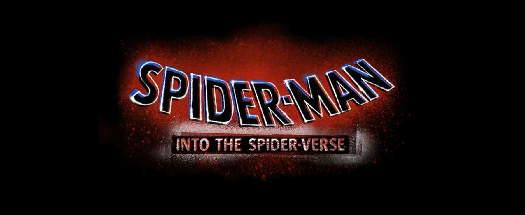
Title Card: Spider-Man: Into the Spider-Verse (2018)
Spider-Man: Into the Spider-Verse was written by Phil Lord and Rodney Rothman and was directed by Bob Persichetti, Peter Ramsey, and Rodney Rothman. It was released in 2018. It was produced by Columbia Pictures, Marvel Entertainment, Sony Pictures Animation, Avi Arad Productions, Lord Miller Productions, and Pascal Pictures. The titles for the film were created by Alma Mater.
Miles Morales, a teenager living in New York City, stumbles into a universe-ending plot when he becomes a new Spider-Man. Feared crime lord, Kingpin, has had a super-collider created so he can open up a bridge to another universe and bring back his deceased wife and son. Miles is instructed by the previous Spider-Man, as he is dying,1 to stop Kingpin before he’s able to go through with his plan and inadvertently tears everything in several universes apart. Miles is joined by five other Spider-Heroes from different universes—seems that some slipped through during Kingpin’s first machine test—and they all work together to find the courage to avert disaster. In doing so, they all learn what it takes to live up to their potential.
I’m still holding firm to the belief that this film will soon be considered not only the best animated film of the last decade, but one of the best films ever made. From a technical perspective, there’s never been anything like this. This is as close as any movie has ever come to portraying a comic book on-screen. Sorry, Ang Lee. I watched this one a couple of months ago and was still impressed with the animation techniques at play. This could have easily turned into a mess of garbage, but instead, it sang. From a story perspective, I find it to be affecting and, like all good Spider-Man films are capable of doing, invigorating. Swinging along with Miles through New York City feels energetic like nothing else. You’ll finish this film and wish you could feel air rushing past your masked face, too. These two qualities intertwine and create a film that lifts itself. The innovative animation gives life to the story and the heartfelt story gives substance to the animation’s style.
Safe to say, this film is still a revelation and it deserved its Oscar win for Best Animated Feature Film. I may have to give it another watch as soon as possible.
WIRED made a fascinating video in which they interviewed Visual Effects Supervisor, Danny Dimian, and Head of Character Animation, Josh Beveridge. The pair talk about their visual inspirations, the choices they made when leading the film’s animation, and how they hoped their work will affect the film’s viewers. It’s a great watch if you’re looking to better understand how it was all done. 🎞
-
R.I.P. Peter Parker. ↩︎
After dealing for the past day or so with a Plex server that seems to have nuked itself, I’ve never been more aware of how little I know about computers and networking.
For those working in tech, are your days full of inscrutable, depressive catastrophes or is it just me?
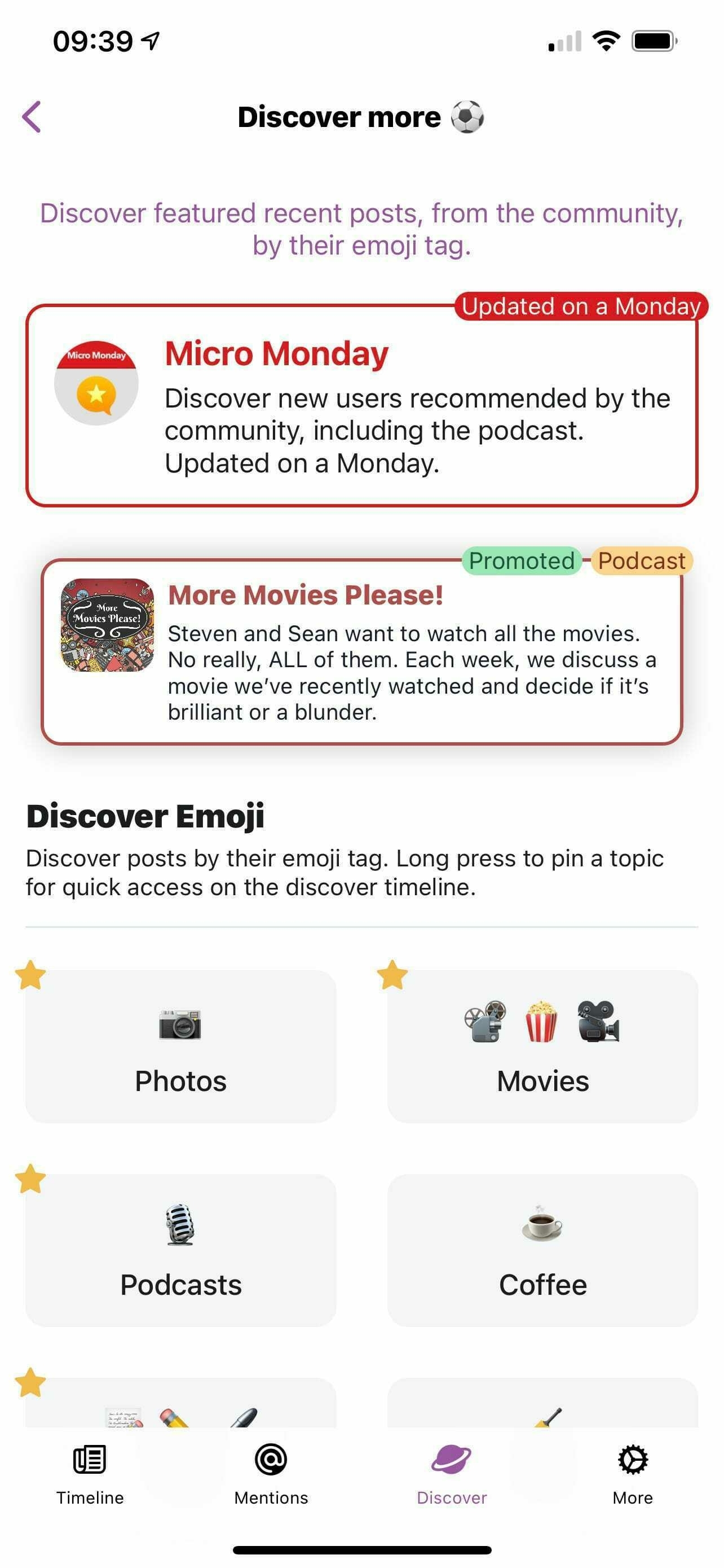
Hey, that’s my podcast being featured on @gluon! If this isn’t the best thing ever, then I don’t know what is.
Thanks so much for doing this, @vincent. You continue to be one of the most thoughtful and giving developers working today. 🥳
Had I but one wish to ask of a genie, I would request the thing that people around the world could truly benefit from: that all pizza become free of calories but remain just as tasty.
I do not doubt that a possible side effect of this wish would be world peace.🍕
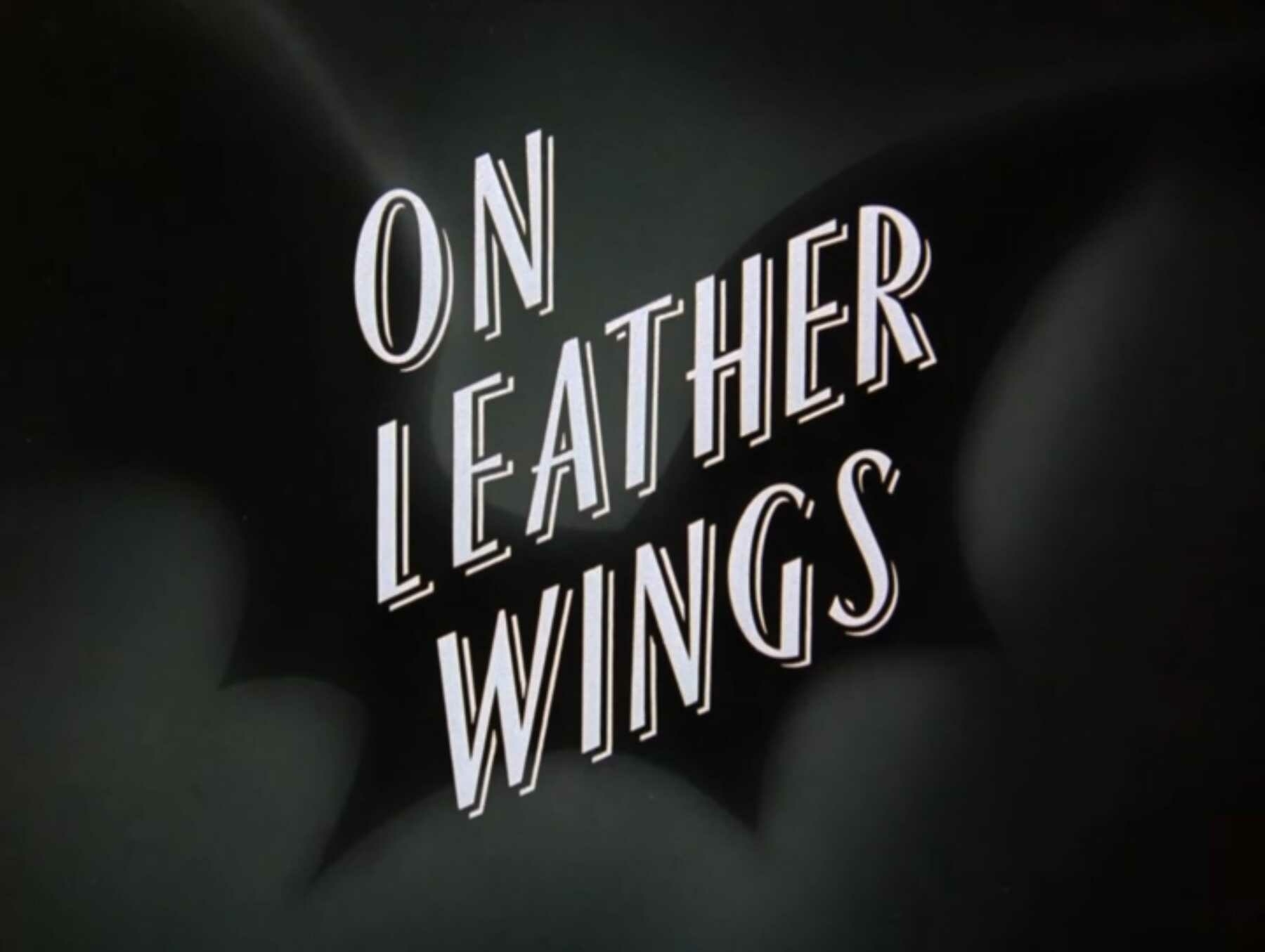
Title Card: On Leather Wings (1992)
Batman: The Animated Series was developed by Mitch Brian, Paul Dini, and Bruce Timm. The show was produced by Warner Bros. Animation. On Leather Wings originally aired on September 6, 1992. It was written by Mitch Brian and directed by Kevin Altieri.
[Note: while IMDb lists On Leather Wings as episode two of the series, on subsequent video releases, it appears as the first episode. The episodes were originally aired out of their production order.]
A giant, man-sized bat is terrorizing Gotham City! After a string of break-ins at local pharmaceutical companies, certain members of the police force are champing at the bit to go after the mysterious and titular Batman. The intrepid Commissioner Gordon, evangelist of the masked vigilante, objects. Batman, believing he was set up, investigates the recent break-in and finds clues that lead him to the Gotham Zoo where a scientist by the name of Kirk Langstrom is employed. Through careful investigation, Batman discovers that poor Langstrom is actually the dreaded Man-Bat and must discover a method to reverse his terrible condition before he’s caught by the police.
A thrilling episode, and a perfect introduction to this heavily stylized, groundbreaking animated show. Not only do we get to witness Batman in all his fearsome, be-cowled glory, but we also get to see him in detective mode throughout the episode. This is a dark cartoon series, and not just because of the unique process of its animators drawing on black paper. The storylines are mature, the voice acting is deadly serious, and we’re shown a Gotham that takes its visual inspiration from gothic, Art Deco architecture.
I was six when this show started airing on television, so my enjoyment of the show, and subsequent awareness of its importance, developed much later. Develop it did, though! At a certain point in my youth, there was a two-hour block of cartoon shows that was essential after school viewing. Batman, Superman: The Animated Series, Pinky and the Brain, and Animaniacs made the toiling through homework hours bearable. Some people may speak highly of the cartoon shows that were made after my preferred group, but for my money, there is still no greater collection of quality animation than what was produced in the mid-‘90s. SpongeBob SquarePants may have become the internet’s darling, but I believe it’ll never hold a candle to the WB classics. They are transcendent and damn if they don’t still hold up. Heck, Hulu even rebooted Animaniacs because of its still passionate fan base. The legacy of those ‘90s shows continues to amaze me.
I’d be completely remiss in my posting duties if I didn’t include the classic and legendary opening sequence of this show. It doesn’t include a title, and frankly, it doesn’t need to. It gives you everything you need to understand what show this is and what you can expect. It’s a real masterclass in short-form storytelling. 🎞
