Ray Fisher Opens Up About ‘Justice League,’ Joss Whedon and Warners: “I Don’t Believe Some of These People Are Fit for Leadership” ↗
I first made reference to this problem in a previous post. That one dealt more with the thoughts I was having about separating art from the artist, but it’s still a good primer.
On April 6, The Hollywood Reporter released this lengthy story that delves further into the heaps of bullshit that actor Ray Fisher has had to deal with concerning the production and aftermath of Justice League. It’s a fine read. What I find unpleasant is that Fisher is still engaged with this fight with Warner Bros., and how much he’s having to defend his own grievances and actions. There appears to be a lot of disbelief over his side of the story, as if he’s a person who would willingly risk the ruination of his acting career just to stick it to some film industry execs. And for what? Out of spite? Boredom? Please.
Isn’t it far more likely that Fisher is telling the truth, and Warner Bros., Joss Whedon, Jon Berg, and Geoff Johns are now scrambling to cover their asses for fear of public backlash and losing future employment? This story is continuing to develop, but I believe this latter scenario to be the truer one. 🎥
Back in late 2016, venerable tech journalist Andy Ihnatko broke the news in a tweet that Sal Soghoian, Apple’s Product Manager of Automation Technologies, left the company when his position was terminated.
In 2017, Apple acquired Workflow, the delightful iOS automation app that punched way above its weight.
Workflow became Shortcuts and was released alongside iOS 12 in September, 2018. It would later become a default app installed on all devices running iOS 13 when that update was released the following year.
The Mac automation app, Automator, has seen no appreciable improvements or updates in a very long time. Indeed, it appears to have been forgotten. In contrast, Shortcuts has seen relatively consistent updates since its release. Automation touches many aspects of iOS now, including within the Home app. In fact, I wouldn’t be surprised if Shortcuts and Home run on much of the same underlying code.
This sequence of events leads me to believe that there is a dim future for Automator on the Mac. Since the acquisition of Workflow, I’ve believed that we’ll see Shortcuts appear on the Mac one day. Apple downsized its old automation department and has subsequently invested heavily in its Shortcuts team.
In many ways, Automator is a remarkable app, but it’s never been user-friendly in the way that Shortcuts is. For people who don’t know much about automation, it’s far too complex and demanding.
Shortcuts, on the other hand, is bright, friendly, and hides its complexity behind action blocks that are easier to figure out. I may not use it as frequently as some people, but when I do the end result is more success and less headaches. If Apple wants non-power user people to get into automation, the answer does not lie in Automator.
I believe Shortcuts is the future of automation on the Mac. I really want to see it on that system. I think it will happen one day. 🍎
UPDATE: Called it.
Los Angeles, CA. January, 2010.
I was taken on a breezy tour of the Jim Henson Company Lot several years ago. Along the way, I spotted a curious impression in the cement. Turns out the location I was standing in used to be the film studio that Charlie Chaplin completed in 1919. Many of his most famous films were shot there.
(I also inadvertently stole Paul F. Tompkins’s parking spot that day, too.) 📷🗺
I’ve spent a good portion of my adult life trying to fashion a career out of something I’m extremely passionate about. Lately I’m wondering, would I be happier just doing any acceptable job and leaving my passions out of work?
I had to take the unfortunate action of turning off the could-be-great Transfer to HomePod feature on my phone. I got very tired of my screen being taken over by the request to transfer what I have playing to my HomePod minis. It’s far too aggressive.
It’s taken me far too long to get into it, but I think I’ve found the text editor that’ll give me everything I need: Drafts by @Agiletortoise. It’s developed into far more than just a place for quick text snippets. I’m really enjoying it.
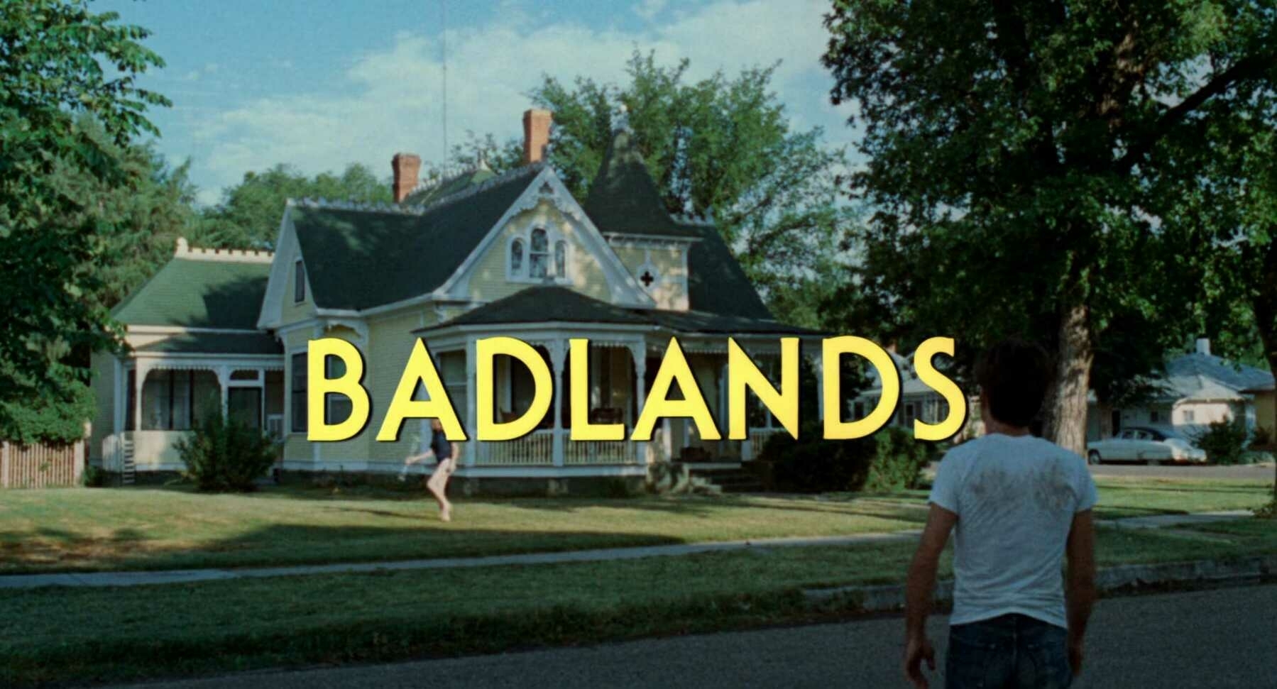
Title Card: Badlands (1973)
Badlands was written and directed by Terrence Malick and released in 1973. It was released by Warner Bros. The titles were done by Consolidated Film Industries.
The film stars Martin Sheen as Kit and Sissy Spacek as Holly. The pair fall for each other hard and right away.1 Holly’s father disapproves, which leads to his violent death at Kit’s hands. The pair go on the run, leaving a growing trail of dead people behind them as they try to evade capture.
This was not the first Malick film I’ve seen. That distinction would go to The Thin Red Line, but by the time I got to Badlands (which was not long after), I was an avowed and major fan of his. I find this one fascinating because it doesn’t quite feel like his other films, but you can already see sprinklings of several of his trademarks. The calm voice-over throughout (done in this one by Spacek); the introspective reflection on life, spirituality, and our place in the world; and of course, the beautiful cinematography from a trio of artists: Brian Probyn, Tak Fujimoto, and Stevan Larner. It may still be Malick’s most straightforward film, and therefore, his most accessible. It’s not the first film about star-crossed murderers, but it is one of the most captivating. There’s violence in this film, but it’s perpetrated by someone with such charisma that the pair even seduces the officers and National Guard troops that eventually end up catching them. For me, this is far more captivating than movies like Bonnie and Clyde, Thelma & Louise, or Natural Born Killers.
Be sure to enjoy this video from The Criterion Collection which delves into Malick’s use of voice-over throughout his work. Editor Billy Weber, who did uncredited work for Badlands, discusses Malick’s inspirations and history with this filmmaking tool. 🎞
-
Although it could rightly be said that Kit rapes Holly, what with him being 25 years old and her being 15. ↩︎
It’s safe to say that if an item ends up in the “Someday” section of my Things app, then that task is lost forever. Like tears in rain, as they say. It’s where tasks go to die.
I recently started watching Mr. Mercedes (after having enjoyed the Stephen King trilogy it’s based on). It’s interesting how many episodes are written by Dennis Lehane. I wonder how many other television adaptations are written by authors who are contemporaries of the original? 📺
Letterboxd Diaries—March 2021
- I Care a Lot: I found it difficult to reconcile my appreciation for the appearance and strong direction of this film with my distaste for its monstrous characters. I get it—not everyone’s a perfect person. But who is there to connect with when its two main characters are such evil assholes? (★★★)
- On the Rocks: It could have easily slipped into mediocrity if it weren’t for the two towering talents of Bill Murray and Rashida Jones. These two together bring such life to the film, and ignite such curiosity in me. It was a delight and made me think of (and miss) my dad. (★★★★)
- Promising Young Woman: Gosh, is there anyone better than Carey Mulligan? I don’t think so. She’s been amazing in everything I’ve seen her in. This was an intense and engrossing revenge thriller. I’m very interested in what director Emerald Fennell has in store for the future. (★★★★)
- Borat Subsequent Moviefilm: Maybe I wasn’t in the right frame of mind for this to work for me? Maybe I needed to be back in my early 20s, like I was when the first one came out? Whatever the case, I didn’t find this enjoyable. I did think Sacha Baron Cohen and Maria Bakalova put in phenomenal work, though. (★½)
- Lilo and Stitch: Well, Stitch is just the most adorable thing ever. And this was a fun film to watch on a lazy weekend. The story had some depth. While I never felt like the stakes were too high, it still offered some good thrills. (★★★½)
- Lady Bird: Wow. Talk about a phenomenal experience. It’s easily one of the best films I’ve watched so far this year. I’m sad I didn’t watch it when it came out, but I’m so happy I got to it now. Every single person was amazing in this. Saoirse Ronan, Laurie Metcalf, Tracy Letts. I have a special place in my heart for Lois Smith’s Sister Sarah Jones character. Greta Gerwig is simply astounding. (★★★★½)
- My Cousin Vinny: This was such a fun movie! Why in the world was this the first I’ve ever seen it? I’m adding this to my list of films that I’m definitely going to watch again sometime in the future. Also, Marisa Tomei absolutely earned her Oscar for this one. She was phenomenal. (★★★★)
- L.A. Story: Having lived in Southern California my entire life, I can say, with absolute certainty, that everything in this film was 100% true and accurate. I also had a lot of fun watching this one all the way through for the first time. It was way more slapstick-ey than I thought it would be, but it was still a nice story about finding love in an unusual way. (★★★★)
- Yes, God, Yes: You’ll breeze through this one, that’s for sure. It clocks in at a brisk 77 minutes, including credits, so it’ll be over before you know it. I don’t think it’s a bad film. I do feel like they clearly stretched the original short film to its breaking point, and yet it’s still too slow. Natalia Dyer, from Stranger Things fame, was as wonderful as ever. (★★★)
- Spider-Man: Far From Home: Definitely not nearly as good as the first of the Tom Holland Spider-Man movies, but a fun time nonetheless. I appreciate that we’re finally getting a Peter Parker that feels a bit truer to his comic book persona. They’re having fun with these films, at least, and that’s always fun to experience. (★★★★)
- The Treasure of the Sierra Madre: Very much a tragedy of Greek and Shakespearean proportions. It’s not just a western and not just a story about trying to find your weight in gold. What’s shown here is a near-total descent into madness, and how it affects everything around you. Talk about an impressive movie in every regard. (★★★★★)
- A Fish Called Wanda: I had a decent time watching this film, but it didn’t seem to have the magic touch with me that it does with so many others. Perhaps it was the constant cruelty done to Michael Palin’s character. Maybe it was Kevin Kline’s boorish, unpleasantly over the top acting. It wasn’t bad. It was okay. (★★★½)
- Cherry: This was undeniably well-acted and directed. Tom Holland and Ciara Bravo were so committed and they elevate this movie. Unfortunately, the story is about a man who destroys all that he touches. His wife is nearly ruined a couple times. He nearly forces his friends into his crimes. The bank tellers he robs? Surely they’re going to experience some PTSD after being held up at gunpoint, but his own troubles are the only thing that matters. (★★★)
- Zack Snyder’s Justice League: Damn, I was impressed with this film. It’s undeniable that it still has its issues, but they paled in comparison to the impressive storytelling that was on display. The original cut of this film suffered because of its reliance on spectacle. It lacked character development, motivations, and heart. With its expansive running time, Zack Snyder’s version was able to turn a very shaky story into something that I would love to see again as soon as possible. I want to witness more auteurism in superhero films. More of this please, DC! (★★★★)
- Deadpool: I love a fresh take on the superhero genre, and this one provided that for me in spades. While it may have relied on the tried and true origin story we’re all familiar with, the character of Deadpool and Ryan Reynolds’s performance elevated the film to a wonderful height. This is not the first time I’ve seen this film, but it still feels fun and fresh. (★★★★½)
- Butch Cassidy and the Sundance Kid: What else can be said about this film, aside from its a classic. A classic for a dang good reason. Newman and Redford together on-screen is always a dynamic combination. I wish they’d done more together. I’d forgotten just how tense a good portion of this film is. The two of them being chased for as long as they were kept me worried for them. (★★★★½)
- Portrait of a Lady on Fire: There are few more beautiful looking movies that came out in 2019. Heck, this one may still be the most sumptuous looking of the whole bunch. That alone would be a fine achievement, but the visuals are accompanied by a lovely and heartbreaking story of hidden love. This film won some major awards at the Cannes Film Festival, among many others, and it deserves every single one of them. This is a staggering work. (★★★★½)
- Unicorn Store: What a delight, and a strong showing from Brie Larson as a director. There are some issues with the story. Bits of the plot don’t get fleshed out nearly enough, and that’s a shame. I’d like to have learned more about the actual Unicorn Store. Still, it’s a breezy film that has a lot of genuine heart. It’s a nice way to spend some time. (★★★½)
- WandaVision: This was more of a limited series, but it’s on Letterboxd so why not? The inventiveness of this story made up for its less unique final episodes. I think it was a great way to stretch this particular genre. Elizabeth Olsen and Paul Bettany give excellent, heartbreaking performances. (★★★★)
- Godzilla (2014): This is a far better Godzilla movie than everybody gave it credit for when it came out. It’s not the best Godzilla movie, but it’s still entertaining. It might be the best looking Godzilla film out there, save for it being an extremely dim film. Heck, cranking up the exposure of the whole film even a little bit would have probably brought my ranking up to four stars. (★★★½)
- Superman/Batman: Apocalypse: The story was mostly nonsensical, not to mention kind of boring. This felt like a slog to get through. The whole pretty Superman character design was strange, too. This one earns its meh. (★★½)
- Deadpool 2: This sequel continues to bring the heart and humor that the first film was chock full of, and I’m grateful it didn’t suck. It feels like one of those rare follow-ups that introduces new elements to the story, but doesn’t go overboard with it. We get Cable, we get X-Force, and we get Julian Dennison, but we still have all of the stuff that made the first film such a fun revelation. (★★★★)
- The Wild Bunch: I can see why this film has achieved the status it has in film history. There’s a lot happening here that’s revolutionary and compelling. However, I found the whole thing a little overlong and plodding in some places. I love its energy when it has some, but there are long stretches that don’t add much to the story or characters. I think it’s a good film, but I don’t know that it’s a great one. Maybe I just need to watch it again. (★★★★)
- A Million Ways to Die in the West: This was a silly film all the way through, and it should never be taken for anything serious. Lower your expectations for this and you’re sure to have a fun time. It relied too much on its self-referential humor for my tastes, but it was decent overall. (★★★)
Total movies watched: 24
Be sure to follow me on Letterboxd! 🎥
I could swear it’s been Friday for the last five or so days.
After much searching, purchasing, disappointment, and finally success, I think I’ve gotten my workspace to a place that makes me happy. It’s all working well.
Did I end up trying IKEA again? Yeah… But that’s beside the point. It turned out well in the end.
Is there something about pickles that I’m just not getting? Everybody I know loves them, and are happy to just eat them straight. Vinegary, sometimes dill-tastin' gherkins seem like a waste of a good cucumber!
What Are the Most Pleasant Streaming Video Player Interfaces?
I’m reminded of Craig Mod’s excellent essay, Fast Software, the Best Software, when I consider the current state of streaming video player interfaces. In the essay, he says that it’s not innovative features or a flashy UI that makes a piece of software the best. Instead, the mark of good software is in how well it performs, or rather, how fast it feels. Software that takes ages to load, bogs down when dealing with a hefty project, or otherwise feels as if you’re trying to work while submerged in a vat of molasses is not the best. I would add to Craig’s thesis that easy to parse and manipulate software also makes for the best software.
Similarly, the various interfaces through which we control our streaming video each have their own speed and feel. Some are so well-designed that using them feels like the screen in front of you is an extension of your body. Others are so damn awful that using them maybe makes you harbor thoughts of flinging your tablet or phone like a Frisbee through an open window.
It’s not luck that turns any of them into a joyful experience. It’s iteration and thoughtful consideration. The poor ones feel slapdash, and appear to be made by people who never actually use the product on which they’re working.
I haven’t used all of them because there are just so many available to us now, but I’ve used several. They all stand out in their own way: some are great, others just get the job done, and a merciful few are loathsome. This is a subjective ranking from worst to best. All images are taken from the iPad versions of these services.
Criterion Channel
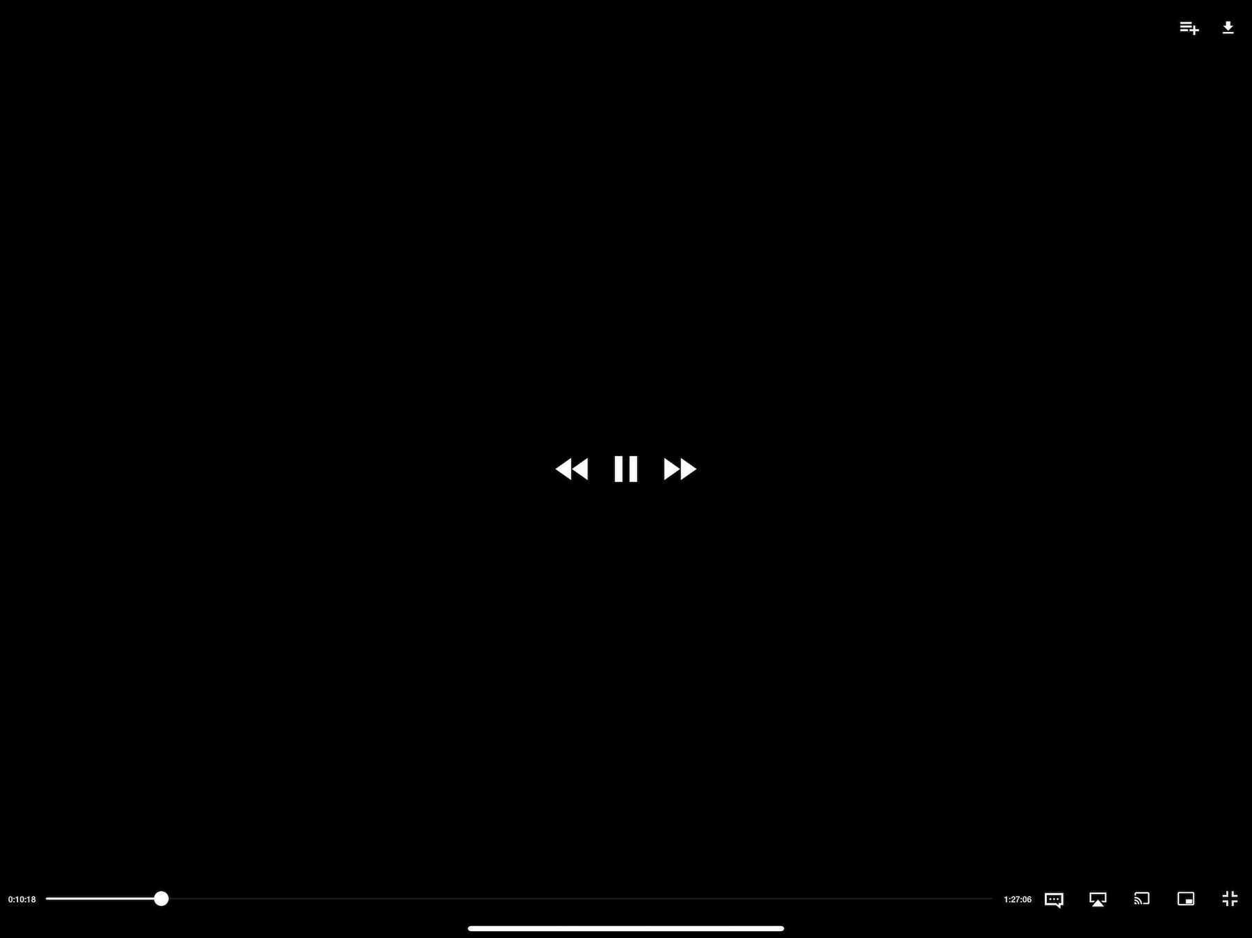
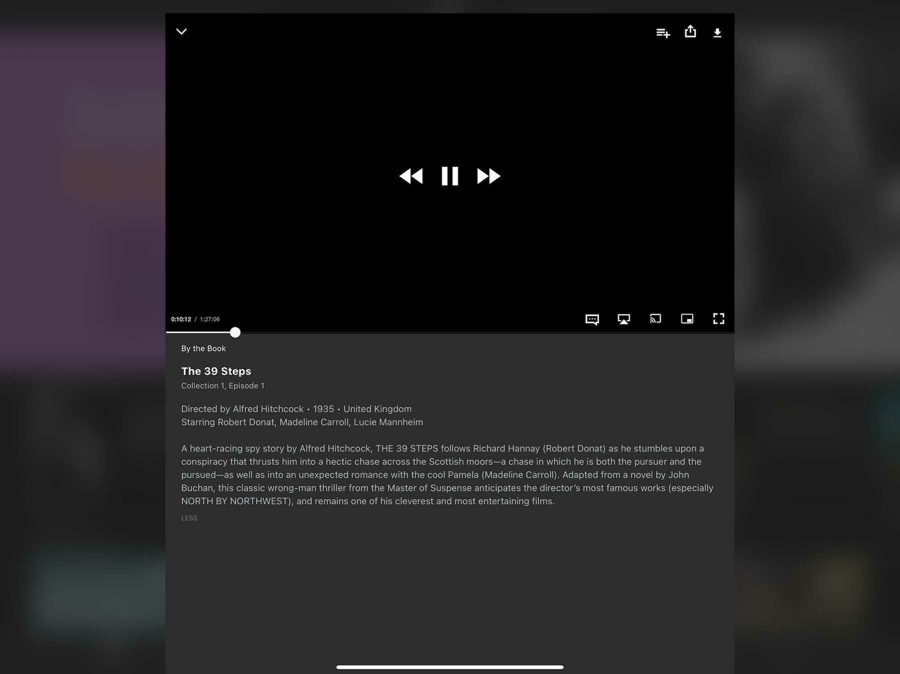
I love The Criterion Collection and their Criterion Channel is a treasure trove of artistry and delight. To be involved with their work in any way would be a dream. Perhaps my job could be improving their player interface because their current offering is a pile of hot garbage.
The major problem with this app is hitting play on a video doesn’t bring it to the fore in glorious full screen. Instead, it starts playing in the description window for the film. Giving yourself the full-screen experience requires additional button presses to get there.
This isn’t unique behavior—YouTube works the same way. However, YouTube doesn’t default to a full-screen player because YouTube is also a social network. It features comments made on videos, additional content to watch, and a description for what you’re watching. Criterion Channel is not a social network. It’s a tightly curated collection of some of the best that cinema has to offer, and there’s nothing but friction involved with it.
Every element feels small and cramped. Good luck hitting pause when the skip buttons are only a few short pixels away from it. Criterion Channel appears to embrace the current “small is hip” trend. There’s nothing wrong with large buttons; they actually make things faster and more enjoyable to use. With these issues, I find myself not wanting to even open the app. It’s a damn shame.
Rating: 2/10
Prime Video
Much like any interface design Amazon tries its hand at, this one just feels clunky and careless. It looks like Amazon’s trying their best, but when stacked up next to something prettier, like Hulu or Discovery+, Prime Video just can’t compete.
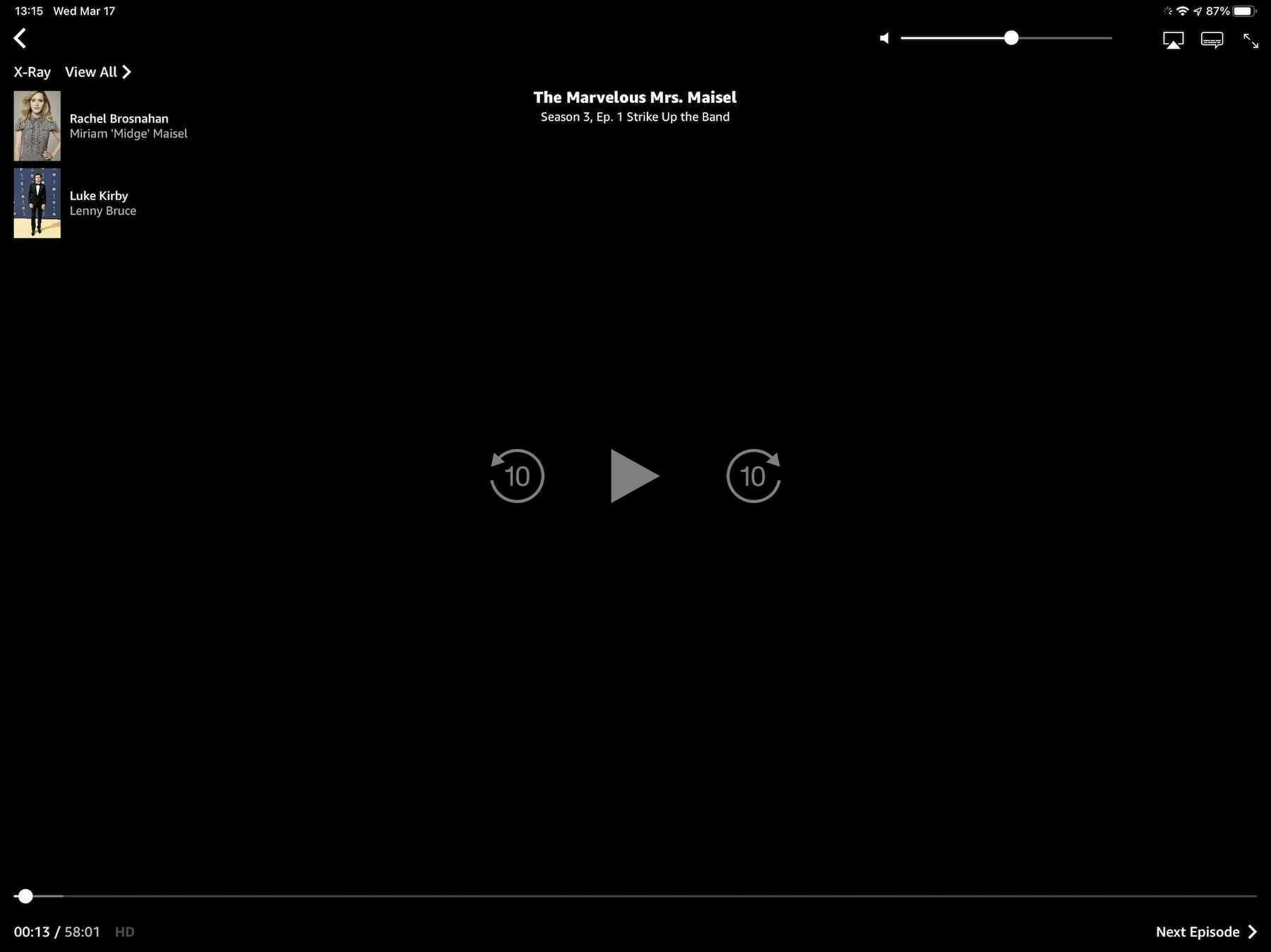
What it lacks in pleasantness, Prime Video makes up for in information density. It can surface and display actors who are currently onscreen, trivia about what’s being viewed, and music that’s being played. This is due in large part to IMDb being an Amazon-owned company. For movie and tv lovers, it’s a treat.
When you dig deeper into the interface, and the service as a whole, it becomes clear that something is a little off. The whole thing feels like it’s being held together by duct tape and chewing gum. It’s the little things like icon alignment that shouldn’t be an issue but are. For example, the small icons in the upper-right corner of the player window aren’t vertically aligned and it’s all I can see now:
This sort of thing shouldn’t happen when a corporation as large as Amazon is making the app. Yet, this sort of laziness appears to be okay with them.
Rating: 4/10
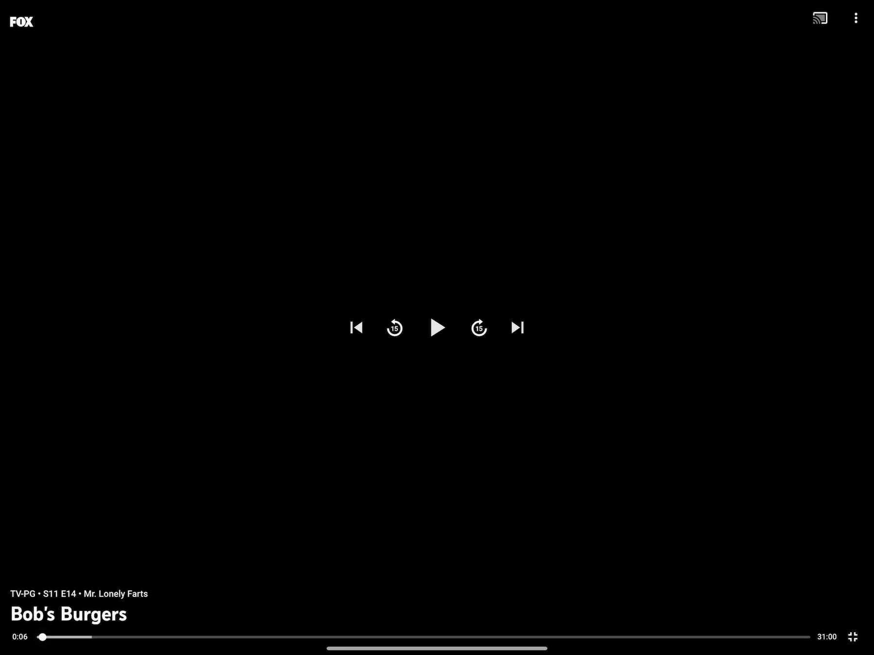
Paramount+
It’s a damn shame that the massive shortcomings of this service overshadows the niceness of this interface. Seriously, what the heck is going on with Paramount+? Aside from a logo change, it’s currently the exact same thing as its predecessor, CBS All Access, and that wasn’t a great service either.
Here’s what the player looks like:
It’s very nice. Here’s a fine example of an economy of information. We know what’s being played, we can play/pause and skip around with ease, and there’s a couple of extras in the top right. This may be the most spartan interface on this list, and I’m down for it. It makes the whole mess of Paramount+ a little easier to stomach.
Seriously, though, what’s wrong with that service? Why doesn’t it have anything resembling a watchlist? Why did they think a logo change and a SpongeBob movie was enough to shake the streaming world? Maybe there’s a mountain of entertainment, but the way to the peak is filled with disappointment.
Still, the player interface is nice and quick.
Rating: 5/10
Discovery+
Discovery+’s interface comes so close to greatness. It flirts with being one of the best of the bunch, but it falls down in a way similar to Criterion Channel. On the one hand, we’ve got some clear, well-defined buttons throughout this interface. There are no hard or sharp edges. Indeed, it feels welcoming.
On the other hand, the play/pause and skip buttons in the center of the screen are positioned so close together that pressing the correct one becomes a challenge. They’re too small and too close. It’s a real letdown.
As a content player, it’s snappy enough. It’s not going to feel too sluggish at any point. The app’s reliance on slow screen animations, e.g., going from a window to a full-screen view, slows things down a touch, but not enough to be frustrating. This is a middle of the road player, and that’s fine.
Curiously, this is also one of the only streaming services that currently doesn’t blank out its content when you take a screenshot. I guess they’re not too worried about piracy.
Rating: 6/10
Peacock
Admittedly, Peacock is the service I’ve used the least. I only signed up for a trial when it premiered because I wanted to watch Psych 2: Lassie Come Home. I’m not that big of a fan of The Office, so I didn’t have any interest in paying for or using the service.
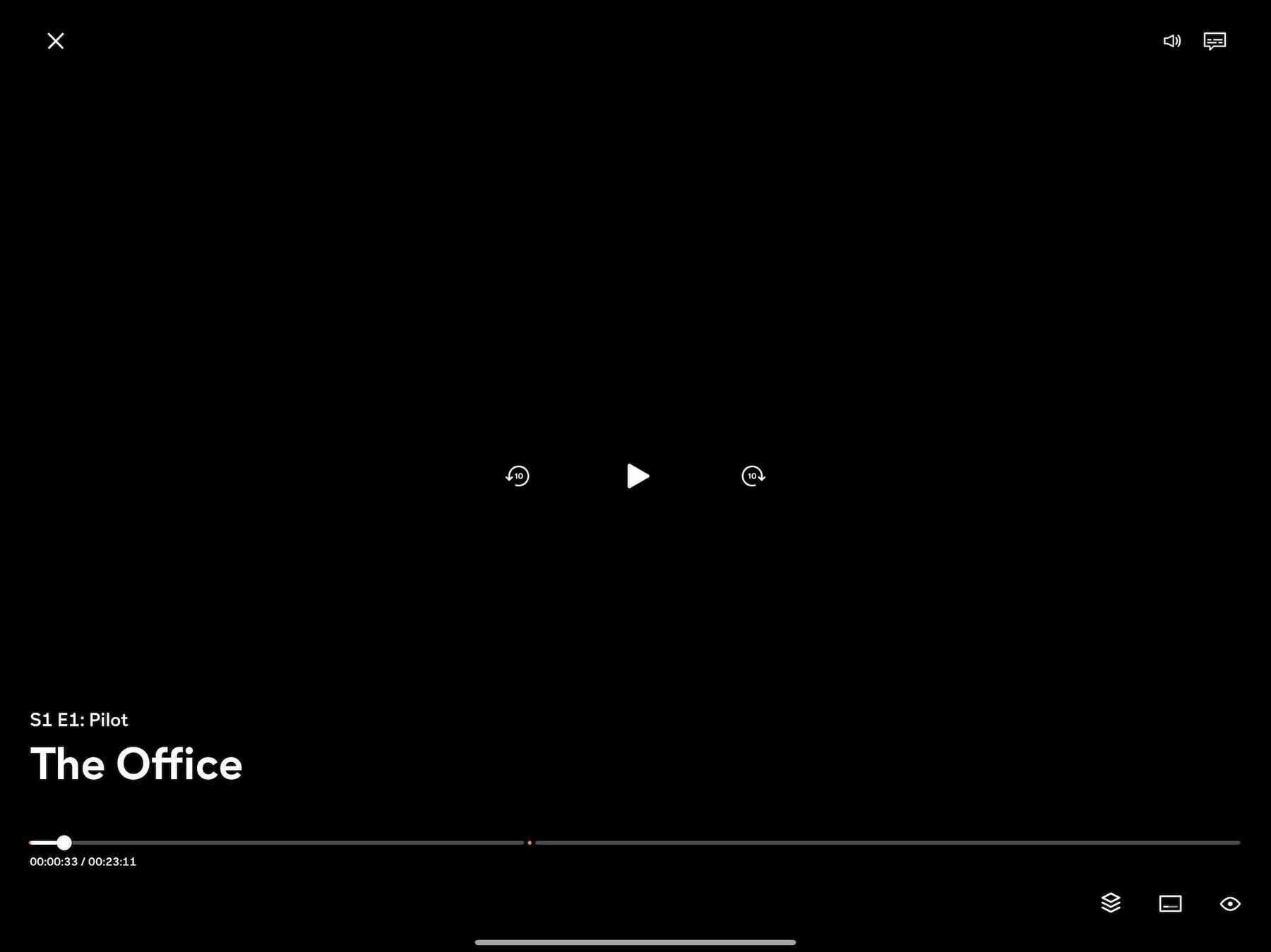
That being said, here’s the interface:
In terms of its speed, it feels adequate. This may have been because it needed to serve me an ad before playing a video, so getting itself going was a small endeavor. Once my chosen video finally started playing, there wasn’t anything about its speed to complain about. Perhaps this wouldn’t be an issue on their ad-free tier?
The buttons throughout the interface are well-designed and well-spaced. It’s all comfortable to use, and nearly everything is clear. My only gripe is with the row of three buttons in the lower-right corner. At first glance, it’s not evident what those buttons are supposed to represent. There’s no accompanying text, so there’s some trial and error involved. If you’ve used many other streaming services, then they may be familiar, but that’s not a sure bet. It could be clearer and more accessible.
Rating: 6/10
HBO Max
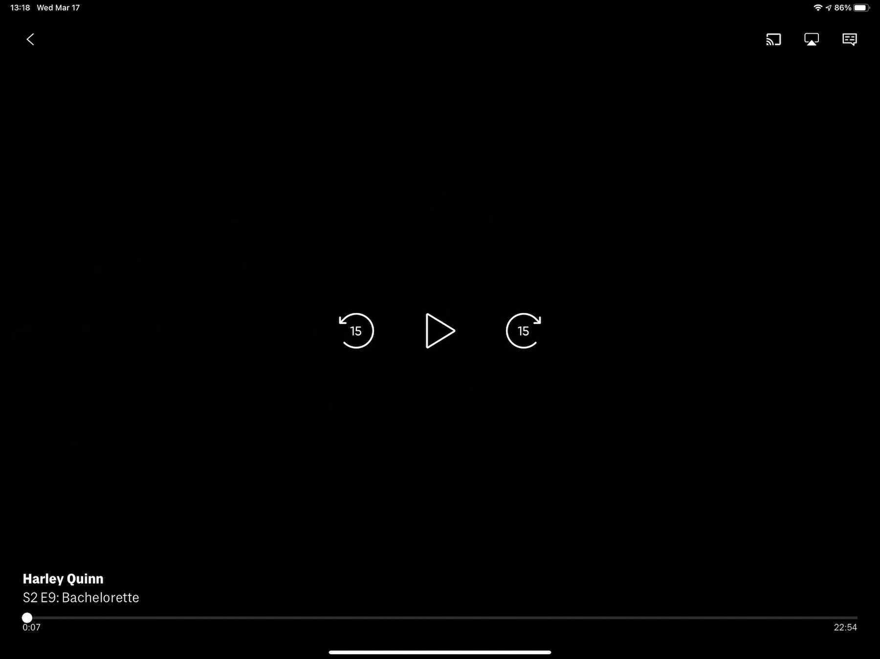
You could place the interfaces of HBO Max and Disney+ side-by-side and they’d both come out as equal winners. The minimal nature of the interface is a big part of why this interface looks so good:
This interface appears to have been designed by someone who doesn’t want to have to squint at their screen. All of its buttons are sized and placed well. The play/pause and skip buttons in the middle are the sort you could probably press accurately with your eyes closed. Heck, even the numbers in the progress bar at the bottom are easy to see.
However, the app’s reliance on slow-moving animations to transition between screens and when starting a video is terrible. It slows down what would otherwise be a fast piece of software. Screens push each other over on every button press, but only after a pause of a second or two, as if the app needs time to think. Getting a video playing is also an exercise in patience, and I have decent internet. The sluggishness of the HBO Max app makes the experience of using it less pleasant; it could have been a real contender.
Rating: 6/10
YouTube TV
I really wish that YouTube TV, Google’s live and on demand tv service, would take more inspiration from its internet video cousin. They’re similar, but not enough in the ways that matter.
With YouTube TV, we’ve got an interface with small, close-packed buttons right in the middle of the action. I wouldn’t mind the multitude of control buttons if they were just spaced further apart. This is especially egregious on a device like an iPad, where the substantial screen real estate goes sadly unused.
The service is quick enough, and that saves it from a world of hurt. You’re not going to find yourself waiting around for screens to animate in or content to start playing. The app feels as present as regular YouTube. Were it anything else, YouTube TV would be closer to the bottom of this list.
Rating: 6/10
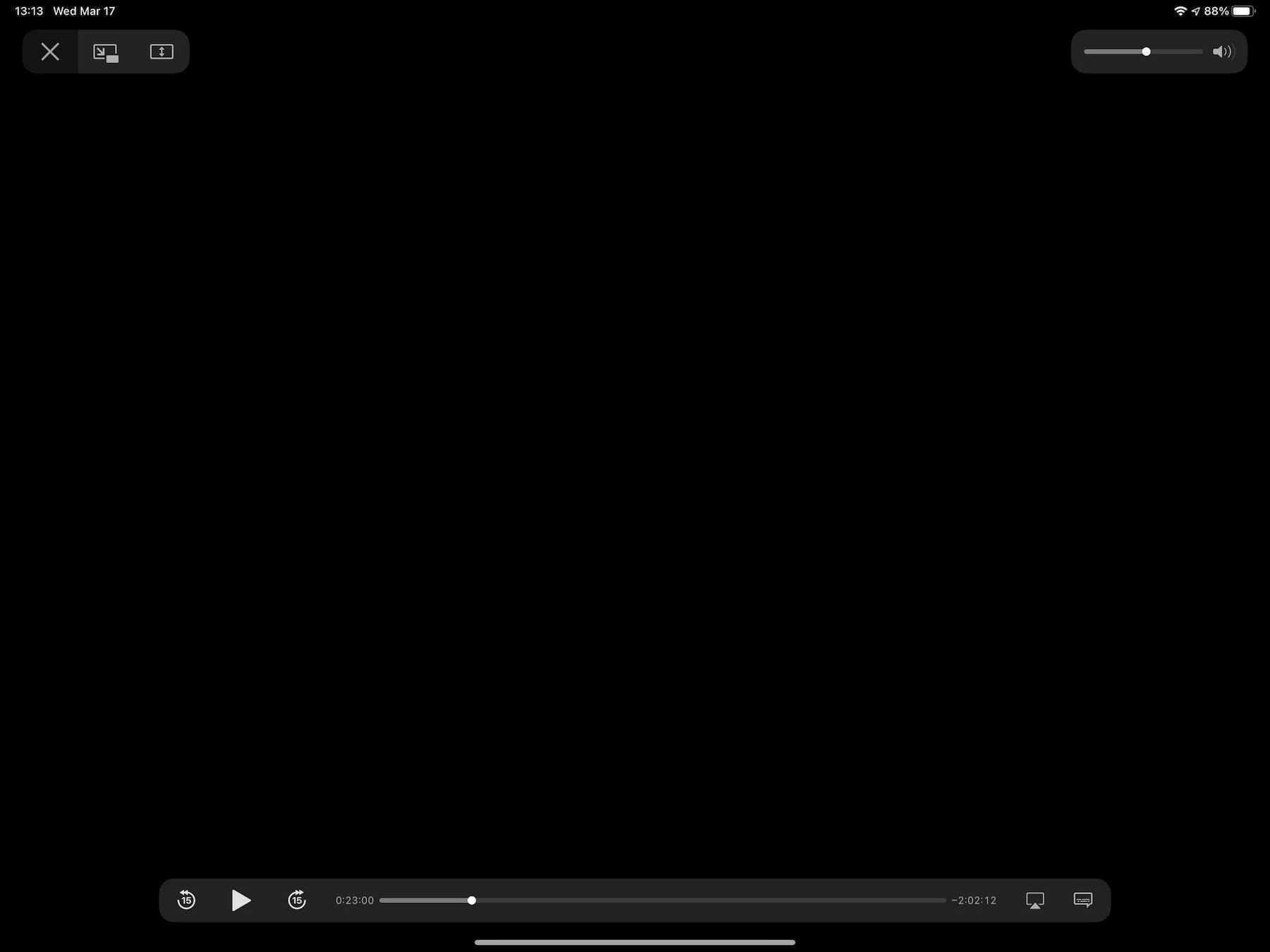
Apple
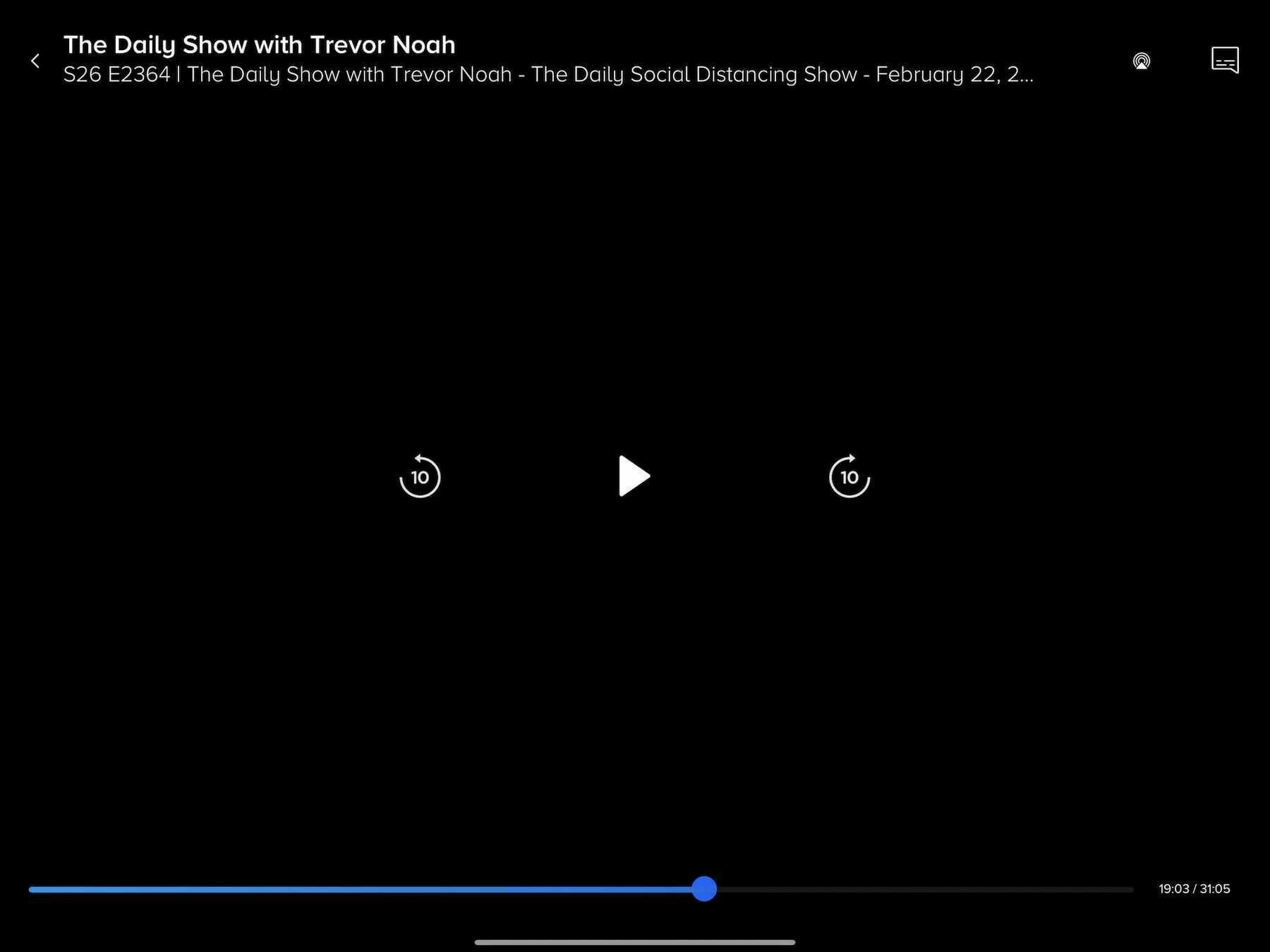
Apple’s player window feels omnipresent, and indeed may be the inspiration for many current video players. This is an interface that millions of people are familiar with on an intimate level. Most video you play on an iPhone or iPad is going to be controlled with this interface:
It’s basic, and includes everything a person needs to view and control video on a screen. Notably, it’s one of the few in this list of players that doesn’t obscure any video in the center of the screen with its play/pause or skip buttons, which bucks the current trend. Not only is Apple’s version unique, in this case it also makes hitting those controls less reliable. Compared to HBO Max or Netflix, it’s all too easy to skip around a video instead of pausing it, or vice versa. I don’t have sausage fingers, but I still find the controls a bit too small. Having to be precise in my tapping slows me down. Slow software is not the best software.
Rating: 7/10
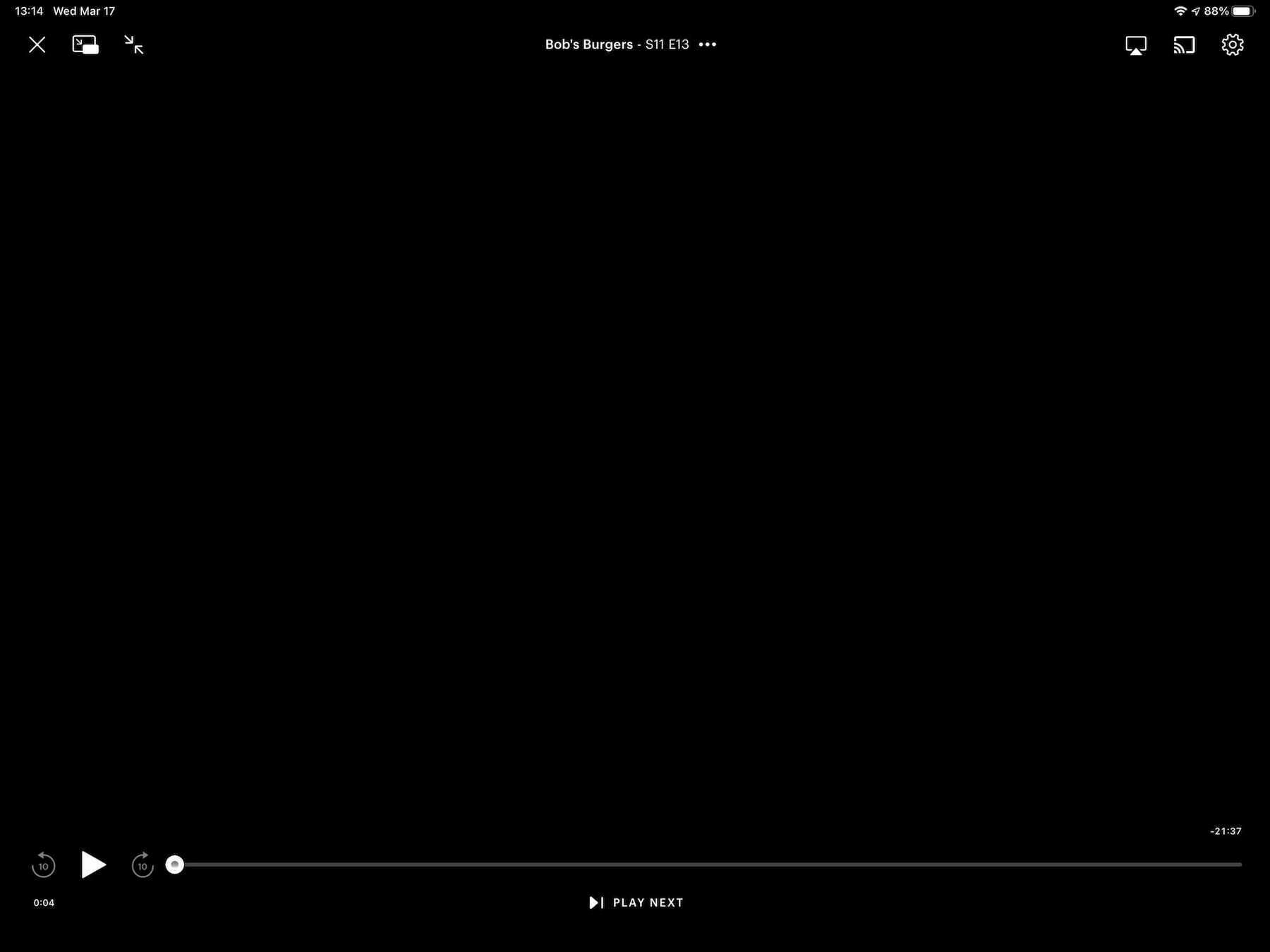
Hulu
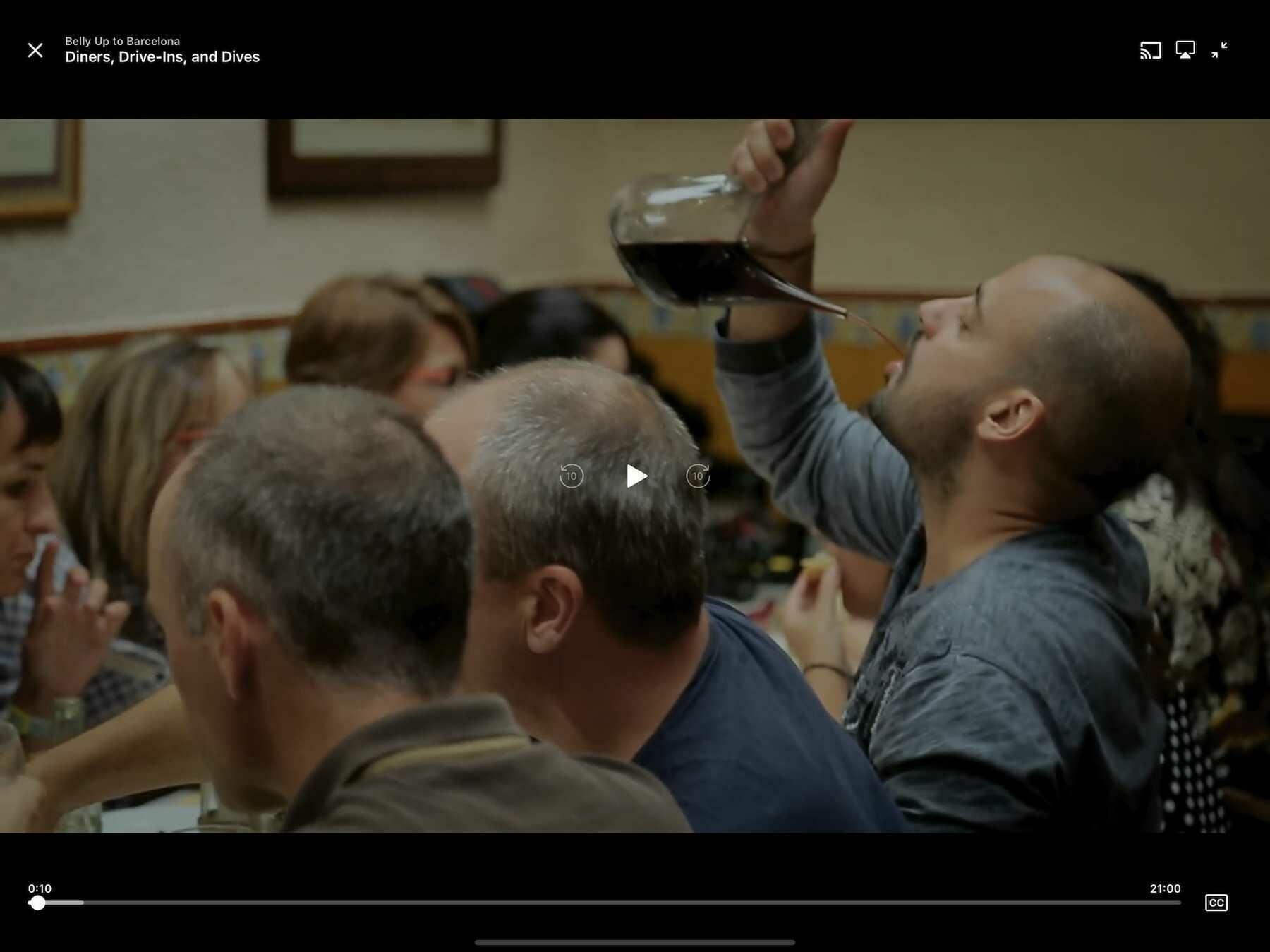
No other service in this list resembles Apple’s player interface as much as Hulu’s does. I think that’s to its credit. We’re in familiar territory with this one:
Hey, if it works for Apple, then why shouldn’t it work for Hulu? This is a curious design, though, considering Disney owns Hulu. I would have expected it to resemble Disney+, or vice versa, in the name of corporate uniformity. Clearly, there are different teams working on these services, and they may want to avoid confusion between the two.
We’ve got a service and a player interface that feels acceptable, and that’s where it stops. It falls prey to the same drawbacks that Apple’s player does. Sticking the play/pause and skip buttons in the lower-left corner makes for a tough time when trying to press the correct button. On the other hand, it’s as speedy as Disney+, and that’s a good thing. You’re not going to feel held back.
Rating: 7/10
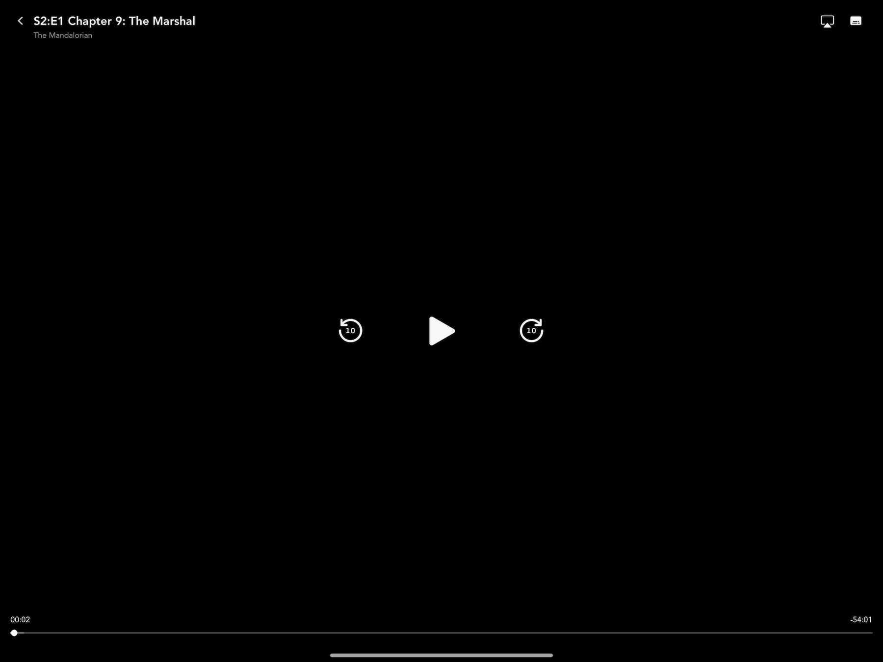
Disney+
Now we’re talking. Considering the money that was spent to ensure that the launch of Disney+ was a success, it’s no wonder that its player interface is a minimalist marvel (no pun intended).
What Disney has chosen to give you feels refreshing. You have only what you need, and that’s more than enough. It’s clear what every button does, and mercifully, the play/pause and skip buttons are large and given a pleasant amount of breathing room. There’s not going to be any accidental button presses here.
This entire service feels refined and snappy. Selecting a video to watch brings up the player instantly, with only a quick wipe animation to sit through. They probably figure there’s no time to wait when young children want to watch their shows. What do they care about flashy animations? This is a pleasure to use.
Rating: 8/10
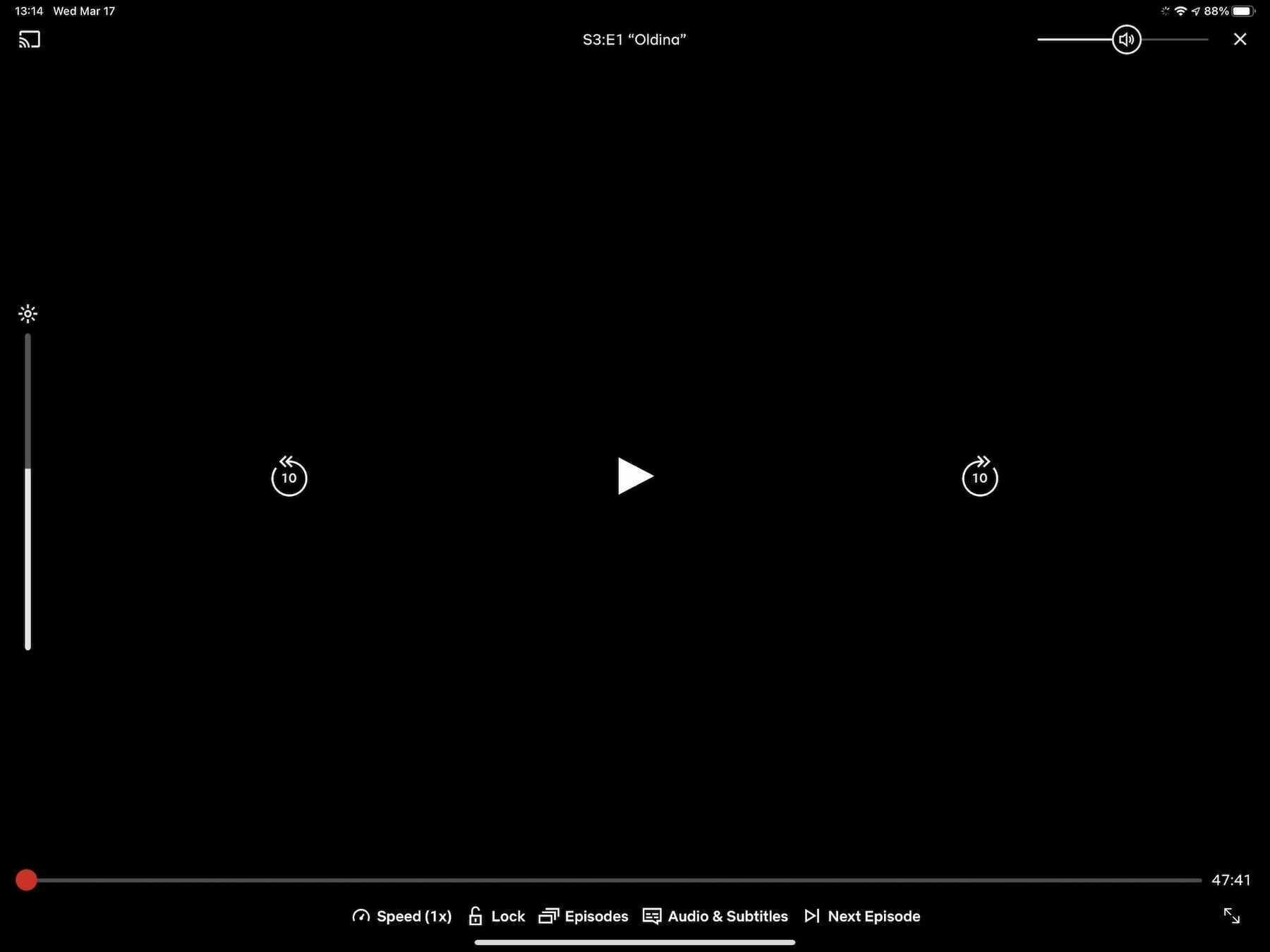
Netflix
Netflix is the gold standard of player interfaces. This isn’t a surprise considering how long they’ve been in the game. Heck, when it comes to streaming content, they were among the first to make online video easy to watch.
However, their lead is becoming tenuous. There’s strong competition coming from the likes of Disney+, and that’s not going to stop. Disney is signing people up for their service at lightning speed.
Browsing through Netflix and starting a video feels smooth and quick. There’s nothing to slow you down when you get a good steam going. They don’t subject you to animations that serve no purpose. It just plays your content when you tell it to. Many other streaming services on this list should take note.
My only concern with Netflix’s interface is it’s beginning to feel heavy. There are many buttons available, and most of them are crammed down at the bottom. Were this player interface to resemble Disney+ more, then it may have earned a perfect score. On the plus side, everything is easy to see and press. It continues to be joyful.
Rating: 9/10
We’ve never had more or better streaming services available to us, and that’s a wonderful thing. It’s nice to have such an assortment of good content waiting for us at any time.
The player interfaces of these various services shows that there’s always room for improvement. In some cases, there’s a desperate need for improvement.
Instead of spending so much of their considerable resources on trying to acquire more content than their competitors, these companies should apply time and effort1 toward making the prettiest and quickest interface imaginable. Admittedly, that’s a tough sell for an aspect of the service that should be mostly invisible. However, an interface that isn’t good-looking or fast is not going to be invisible. It’s going to be screamingly obvious and bad.
Friction drives people away. Ease invites people in.
-
That is to say, money. ↩︎
It’s a real shame to see that the unique and clever American Gods has been canceled. This was the first Neil Gaiman book I ever read, so it holds a special place in my heart. I hope they’ll be able to wrap things up with a possible movie. 📺
Spring seems to come quicker and quicker ever year, and it’s always a surprise. One day, I’m lounging around in comfy pants and a sweater, and the next I’m wishing it would be December again. It should not be in the high 80s in March! 🥵
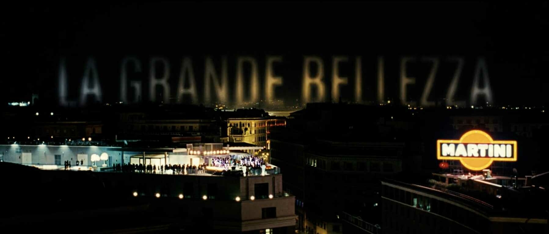
Title Card: The Great Beauty (2013)
The Great Beauty (or La grande bellezza, as it’s originally known) was directed by Paolo Sorrentino and released in 2013. It was produced by Indigo Film, Medusa Film, Babe Film, Pathé, and France 2 Cinéma. The main titles supervisor was Francesca Di Giamberardino.
The film stars Toni Servillo as theater critic, Jep Gambardella. Turning 65 and learning of the death of his first and greatest love is a complete shock to his system. Now feeling without purpose, he ventures out into Italy, and away from the vapid parties he once frequented as nothing much more than a socialite. He meets people, hears their captivating, sometimes painful stories, and finds the inspiration and drive to create again.
Since first seeing this film when it was released by The Criterion Collection sometime around 2014, I’ve continuously been awestruck by its storytelling and beauty. Paolo Sorrentino’s exquisite writing and direction, couple with the brilliant camerawork of cinematographer Luca Bigazzi, is truly something special. I try to get everyone I know to watch it. I’m not of the age or status where I can see myself reflected in the character of Jep, but his search for truth, beauty, and lost creativity is something that can rightly be called universal. This film won the Oscar for Best Foreign Language Film at the 86th Academy Awards in March, 2014, and deservedly so. There was no other film released that year that better examines what it means to search for meaning in life, and then feel the satisfaction of finding it.
Criterion did a nice interview with Paolo Sorrentino around the release of this film, in which they talk about his history with and love for movies. It’s a quick watch and fun to hear from a modern master about his filmmaking inspirations. 🎞
Jessica Walter, ‘Arrested Development’ and ‘Archer’ Star, Dies at 80 ↗
Damn, this one sucks. I’m not familiar with all of her work, but I am very familiar with and love Arrested Development. Lucille Bluth was one of the all time great characters. I’ll miss her a lot.

